Spotted! Jamie Oliver IGTV featuring… Our Teardrop Glass Pendants

We supplied this glass lighting design of three Teardrop Pendants for Jamie Oliver some years ago, so it was great to spot it still looking very fine on a recent IGTV broadcast by Jamie recently.

We supplied this glass lighting design of three Teardrop Pendants for Jamie Oliver some years ago, so it was great to spot it still looking very fine on a recent IGTV broadcast by Jamie recently.

Our Insta friend Anna Collette Hunt spotted and tagged us on Jamie Oliver's most recent video post to IGTV.  Though not exactly stars of the show, our Teardrop Glass Pendants in Garnet Red are still looking very fine in one of Jamie’s kitchens.

Speaking about two things close to Jamie’s heart – nourishment and his children preparing for exams – we couldn’t agree more.

Check out the full video on IGTV: https://www.instagram.com/tv/Bw2KIjpnX3_/?hl=en

Milan Design Week at San Barnaba's Cloisters

Ume lanterns glowing under the courtyard trees

Ume lanterns glowing under the courtyard trees

Curiousa & Curiousa's Opening Night at San Barnaba's Cloisters, Milan

We're so excited for the very first time to be taking part in Milan Design Week, having been invited to dress the I Chiostri di San Barnaba restaurant situated in the magnificent 15th Century cloisters and courtyard of San Barnaba.

The opening night drew in over 150 guests, where they were greeted by a series of our hand-blown glass Cluster Chandeliers glowing in the  covered colonnades, our silk Ume Lanterns gently illuminating the shaded courtyard and a combination of Triptych and Stemmed Retro Glass lIghts in the alfresco dining area. 

Alongside our lights there are also displays by the wonderful Pink Pampas, with their vibrant Mexican interior motifs, and Vitra's card designs by Alexander Girard and Charles & Ray Eames. The theme of the evening was to ‘Make a Wish’, write it on a card and hang it on one of the courtyard trees.

Milan also marks the first time we have exhibited outside of a main exhibition hall. It really has proved a treat and a privilege to see our lights transform such an amazing and historic space and meet so many amazing and enthusiastic Milanese. What a wonderful evening!

San Barnarba’s

San Barnarba’s

Preparations on Monday

Preparations on Monday

The opening night. Photo by Marco.Beck Peccoz.

The opening night. Photo by Marco.Beck Peccoz.

The Triptych Stem and Triptych Dine looking beautiful in the covered dining area.

The Triptych Stem and Triptych Dine looking beautiful in the covered dining area.

Acid Drop Clusters, Cathrine and Pear Drop Chandeliers

Acid Drop Clusters, Cathrine and Pear Drop Chandeliers

Esther at the opening.

Esther at the opening.

Paul looking very relaxed and happy at the opening party, Photos by Marco.Beck Peccoz.

Paul looking very relaxed and happy at the opening party, Photos by Marco.Beck Peccoz.

Ume Lanterns and “Make a Wish’ Cards suspended in the trees.

Ume Lanterns and “Make a Wish’ Cards suspended in the trees.

Photo by Marco.Beck Peccoz

Photo by Marco.Beck Peccoz

Ume Lanterns looking stunning in their courtyard trees.

Ume Lanterns looking stunning in their courtyard trees.

Salon de Mobile runs through until Sunday 14th after which we'll be starting off on our long drive home, but already, we know it's been worth every mile! 

Thanks to Matthew Noble, Francesca Ballini Richards and Valentina Manfredi for organising a beautiful event and I Chiostri di San Barnaba for being such hospitable and fantastic hosts.

I Chiostri di San Barnaba, Via S. Barnaba, 48, 20122 Milano
Open everyday from 12.30 - 22.30
9th - 14th April


To make an appointment email us studio@curiousa.co.uk
Or call on+44 (0)1629 826284

Esther, Japan & Salon De Favori

Twenty three glass colour samples on display

Twenty three glass colour samples on display

BIG IN JAPAN: SHRINES, SUSHI & SALON DE FAVORI

Esther and Paul have now returned from their travels in Japan, full of tales of adventures and photographs of spectacular shrines, amazing sushi and the neon-lit Tokyo night life. Esther explains, “Japan is just such an inspirational country - so unique and full of fascinating details and differences. This is only my second visit to Japan so I was excited to be shown around by Terry and Kumiko.”

Terry and Kumiko are the founders of Salon De Favori, a Tokyo based interior design house who specialise in importing high-end Western interiors. Having met Esther in 2016, they now import a wide range of Curiousa’s lights into the Japanese market as sole distributors, managing the stringent electrical certification which had proved a barrier previously.

Esther was invited to introduce the brand and her story to over 50 Tokyo based interior designers and architects, each of which were given a small gift from Curiousa & Curiousa - a handblown glass bird - as is the tradition in Japan. “The reception and hospitality was fantastic and we’ve already received lots of interest and enquiries from our visit. There really isn’t anything on the Japanese market similar to our lights so we’re excited to bring UK hand-blown glass lighting with colour at the heart of their appeal.”

Esther explained her design inspiration and talked of the influences and artistic development, from her exploration of naturally dying silk from various lichens whilst still a teenager, to the artists and artistic movements helped shape her love of colour, as well as explaining how Curiousa & Curiousa was formed some nine years ago.


"It was a bit daunting speaking in front of so many people, but everyone was so receptive and showed real interested in my story.  I'm so excited by this opportunity as I really enjoy the culture, customs and food of Japan, so to think my designs are really appreciated here makes me feel very proud". 

70e31b84-b16b-43e0-aa41-706cc5f8a789.JPG
Esther, Kumiko and her team preparing for the presentation

Esther, Kumiko and her team preparing for the presentation

837e6fa1-7a28-4341-be9d-8273607dd54b.JPG
e3bcce52-7f27-4414-8b74-f0d406154b3d.JPG
Paul and Esther at a shrine in Tokyo.

Paul and Esther at a shrine in Tokyo.

The NEW Tor Light

Tor_mailchimp_01.jpg

We are pleased to announce the latest addition to our hand-blown glass pendant light range - The Tor Light.

This slick new design has been developed by Esther Patterson the designer behind Curiousa & Curiousa and is hand-blown in Derbyshire without moulds, making every piece unique. The Tor Light has a refined look with modern sweeping lines combined with a bold yet natural colour palette.

The Tor Light is named after Mam Tor, translated ‘Mother Hill’, which is situated not far from their Derbyshire workshop. The main image shows the select colour palette reflecting the beautiful landscape of this High Peak ridge, combining the grey tones of the limestone mass with the reds and yellows of the local flora in the setting sun, balancing perfectly with its dusky blush interior. 

Esther further explained her thinking behind the light. “I wanted the Tor Light to be a sophisticated addition to our range so I developed a compact brushed brass fitting and complimented this with a petite E14 bulb by sustainable LED lighting manufacturers, Tala. The strong clean lines are softened by the High Peak landscape colour palette, forming the perfect balance between strength and beauty. The Tor Lights would work especially well in a row over a kitchen island or arranged in an eclectic group over a dining area.”

This light is available in 23 different colours, pictured here in Slate Grey, Garnet Red and Yellow Ochre.

Click here to see our full range of colours and finishes.

Tor_Mailchimp.jpg

Tor Lights in Yellow Ochre, Slate Grey and Garnet Red.

Photo by Egner Photography

Photo by Egner Photography

English Home New Years Honours List

English_Home_Honours_List.jpg

We are delighted English Home magazine have included us in their New Years Honours List. They love our decorative lights for wet areas and the fact that we're pushing the boundaries, using colour in bold and new ways and bringing an adventurous spirit to lighting in bathrooms.

We’ve been picked out alongside Tamasine Osher and her beautiful hand carved wooden pendants. Also, Celerie Kemble’s mid-century Parisian and Italian style lights for US based Arteriors.

Click here to read the FULL article

Also, if you missed the Living Etc article about our new IP45 bathroom lights read here 

English_Home_Honours_Lighting_1.jpg

The Guardian’s observer Feature - Behind the Scenes at the Malthouse

behind_the_scenes_at_the_malthouse_logo.jpg

With many designers, their sense of style, imagination and personality continue throughout every area of their lives, and nowhere is this reflected more clearly than in their homes - Esther’s home is a wonderful example of this. This month we were thrilled to have an article in the Guardian’s ‘Observer Interiors’ that featured the Malt House, the home Esther and Paul have lovingly renovated here in Wirksworth. Read the article to see a behind-the-scenes snapshot of Esther’s life outside of Curiousa & Curiousa, and an insight to the style, tastes and principles that her work stems from.

Click here to read the article

Not all of the photographs taken on the day were able to get into the article but we are so pleased with them that we decided to share some of the unseen ones here, including images of Esther and Paul’s other business ‘The Northern Light Cinema’ situated on the ground floor of the Malthouse. Scroll down to see them.

A Lotus Dine above the kitchen island.

A Lotus Dine above the kitchen island.

The Ume Lanterns positioned at different heights in the living area.

The Ume Lanterns positioned at different heights in the living area.

Sitting_Roon1.jpg
Ume_Lounge_1.jpg
An Acid Cluster and custom Chandelier in the background.

An Acid Cluster and custom Chandelier in the background.

A sight yet unseen - here’s a sneak peek of ‘Cocoon’ - a light featuring brass and walnut fittings due to be launched this year. Keep an eye on our social media and newsletter for the official launch. The mural is by Esther and Paul’s son, Gabriel C…

A sight yet unseen - here’s a sneak peek of ‘Cocoon’ - a light featuring brass and walnut fittings due to be launched this year. Keep an eye on our social media and newsletter for the official launch. The mural is by Esther and Paul’s son, Gabriel Carr, and the red wire chair is from Bright Potato.

Two Tassel Lights and a selection of Table Lamps in the bedroom.

Two Tassel Lights and a selection of Table Lamps in the bedroom.

The Japonica Wall Light against Stoney Wood Wallpaper.

The Japonica Wall Light against Stoney Wood Wallpaper.

Bedroom_5.jpg
The Northern Light CinemaThe fully functioning cinema shows a curated mix of current films, old favourites and even live theatre streams. Find out more about the cinema on the website.

The Northern Light Cinema

The fully functioning cinema shows a curated mix of current films, old favourites and even live theatre streams. Find out more about the cinema on the website.

Providing great scope for Curiousa style, the cinema’s interior (designed entirely by Esther and Paul) features several lights and chandeliers throughout the bar and auditorium.

Providing great scope for Curiousa style, the cinema’s interior (designed entirely by Esther and Paul) features several lights and chandeliers throughout the bar and auditorium.

A selection of Acid Drops in varying sizes with a few lights from the Classic Pendant Range over the bar and tables.

A selection of Acid Drops in varying sizes with a few lights from the Classic Pendant Range over the bar and tables.

The Tassel Wall Light keeps up with Ava Gardner’s glamour. (Image by Chris Webb Photography).

The Tassel Wall Light keeps up with Ava Gardner’s glamour. (Image by Chris Webb Photography).

The auditorium features a few Teardrop Pendants in different colours. Photo by Jez Brough. See more about the cinema on photographer James Balston’s blog here.Click here to read the full article and see a few more images.

The auditorium features a few Teardrop Pendants in different colours. Photo by Jez Brough. See more about the cinema on photographer James Balston’s blog here.

Click here to read the full article and see a few more images.

All photography by James Balston unless stated otherwise.

IP45 Bathroom Light Range and ‘Living Etc’ Feature

“Your bathroom lighting prayers have been answered”

We are excited to announce that 75% of our range can now be made to IP45 standards, meaning they can be used in wet areas such as bathrooms (zones 1 & 2) and outdoor areas. By using an enclosed LED G9 bulb and a non-twisted fabric covered flex, we are now able to offer pendants, wall lights and even chandeliers!

The wet area lights have certainly made a ‘splash’, being instantly snapped up by the LivingEtc website where they were described as a ‘gamechanger’ for bathroom lighting! (Read the article here.)

As designer and director Esther Patterson says “There hasn’t been a lot of choice out there for bathroom lights with personality, or colour even for that matter – so we wanted to challenge that idea and giving our clients that extra level of freedom when designing for bathrooms and wet areas.”

Each wall light is made to order with five fitting finishes and a choice of 23 glass colours. Browse of the full collection of lights and read more here.

Launched at Decorex 2018: Garden Is Sanctuary

Fabio1.jpg

Last week we took to London to launch our newest collection at Decorex International. Although seasoned Decorex exhibitors in our fifth year, this collection marked many firsts for us as a company - from our first departure from glass into print and pattern with the Ume Lanterns, to our first lights made outside of the UK. This collection has been an exciting journey for both Esther and the team and we are thrilled with the response we have had to it.

This year’s stand reflected a botanical theme as Esther’s inspirations from the surrounding Derbyshire countryside shone through into her work. A mix of floral imagery, colours and shapes inspired by Esther’s own garden were brought to life through an opulent silver-stemmed chandelier, Oriental inspired coloured glass lights, and silk lanterns set against the backdrop of Esther’s personally designed wallpaper, ‘Garden is Sanctuary’. 

The Ume Lantern

Our first venture into silk lighting, this light displays a dramatically printed garden scene featuring ferns and peonies taken from the original paintings and sketches of Esther’s own Derbyshire garden. Read more about the inspiration behind this light here, and find out the product details here.

The Fabio

The Fabio chandelier features six hand-blown glass pendants with mirrored stems suspended from a floating mirrored ceiling plate. This luxurious piece was specially blown by Murano glass blower Fabio Fornasier and inspired by a visit of designer and director Esther Patterson, to Fabio’s prestigious Murano glass studio in Venice. Find out more about the Fabio here.

The Siren

This playful wall light is a striking combination of fine bone china tableware and coloured handblown glass in a mix of traditional and contemporary design - a modern twist on a decorative wall plate that reflects the whimsical style that we are known for. View the product details for the Siren here.

The Japonica

Lastly the elegant Japonica wall light takes its inspiration from the Far East with its layered pendant shape and black lacquer wood finish.

As well as displaying our own lights at Decorex it was wonderful to see all the new designs coming out from the incredibly talented designers throughout the whole festival. We have featured some of our favourites on our Instagram @curiousastudio. Don’t forget to follow us to see more of our inspiration and behind the scenes stories.

Although we are back in the Derbyshire Dales for the time being, we do have our Chelsea showroom permanently open for appointments, and we will coming back to London in November to exhibit at SLEEP + EAT where we will be launching lights made specifically with the hospitality industry in mind.

Photos by Chris Webb Photography

Launching at Decorex International: The Fabio

Fabio_portrait_advert copy.jpg


Designed by Esther Patterson and hand-blown by master glassmaker Fabio Fornasier, our latest light brings the authentic touch of Murano Glass to our collection.

The Venetian Island of Murano has been heralded as the pinnacle of glass blowing craft for centuries, and for the last 20 years, Murano glassmaker Fabio Fornasier has been wowing the glass world with his contemporary take on traditional Murano style. From oil lamp chandeliers to experiments with glass acoustics, he has combined an innovative artistic curiosity with expert craftsmanship. With this in mind, it’s not a surprise that his creations have caught the eye of designers and makers all over the world - one of which is our head designer, Esther Patterson.


Fabio is known for large statement pieces, chandeliers comprised of hand-blown glass shapes that appear to be moving and change appearance from wherever they are viewed from.

Fascinated by the history of Murano glass and their centuries-old specialist techniques, Esther visited Murano in 2016 and was able to see Fabio create his signature tapering style glass pieces in person. Describing the experience, she said “watching Fabio at work was truly amazing and a privilege - he truly is a master at work.” It was then that she was inspired to work with him, seeing a possibility to “combine the Curiousa simplicity of form with a dash of Fabio’s flare”.


The resulting design for the light takes elements of Fabio’s fluid style with his long tapering stems, enhanced further through its luxurious hand-silvered mirror finish. The hand-silvering technique is a Murano specialism, whereby liquid silver nitrate is poured into the cooled glass and creating a luxurious mirror effect. 

Fabio_Cut_Out_Single.jpg

With this light, Esther blends his tapering style with a more linear approach, a style that you can see through her collection in Sculptural Stacks and Stemmed pieces. The piece consists of the hand-silvered Stem, transparent glass Shade and glass ceiling rose known as a Canopy. The elegant style gives it a versatility that allows it to be positioned as a single statement light or grouped together as a Multi-Drop Chandelier.

FABIO CHANDELIER.47.jpeg

Fabio’s mastery with glass as well as the materials available within Murano have enabled Esther to realise this particular creative vision, and we are thrilled to be able to offer this authentic Murano glass piece as a part of our collection.

We will be launching the Fabio this year at Decorex International from 16th 19th September, where it will be displayed as an exclusive Six-Drop Chandelier, made by Fabio especially for the launch. Come along and see it in person.

View Fabio's website here, and find out the details of this product here.


The Story Behind the Ume Lantern

The flower garden and the surrounding countryside that provided a lot of the inspiration for our lights over the last year shine through no clearer than in our latest light, the Ume Lantern.

In a slight diversion from our signature glass pendant lights, Esther has embraced a different way of expressing her love of nature with this light, which features floral imagery taken from original paintings, printed onto natural Dupion Silk.

As this light is so different, we wanted to show a little of the background and inspiration behind it.

dupion_silk.jpg

Heavily influenced by Oriental style, the use of silk was the obvious choice for the light, not only allowing us to create bigger pieces, but also enabling Esther to bring together the many elements that inspire her work, while harking back to her roots of print and textiles.

Esther’s Sketchbook

The original design for the print comes from a series of drawings taken from Esther’s own garden in Derbyshire. Below are some of the photos and drawings of peonies, irises and grasses that made up the pattern on the design.

esther Painting.jpg

Although a diversion for Curiousa, the move into print and pattern is a hark back to her roots, as previously to glass lights, Esther started out designing wallpapers and working with pattern and print.  

Still very much inspired by print and pattern in her work today, the paintings of plants and flowers have been made into a wallpaper, entitled ‘Garden is Sanctuary’, as well as another design called 'Stoney Wood'. If you've been following our work over the last year, you may recognise the wallpaper from the background of the Japonica and Snowdrop photo shoots!

In both designs, you can see strong elements of nature coming through, as well as subtle Oriental influences as seen in the ‘Stoney Wood’ design, inspired by the beautiful chinoiserie wallpaper in Chatsworth House in Derbyshire.

The 'Garden is Sanctuary' design now features on the Ume Lantern printed onto the silk, alongside the 'Stoney Wood' design, 'Red Spike', 'Peony' and other designs options inspired by their colourful elements. 

Although it may come as a surprise that there is no glass in this light, glass still holds a place in the bigger picture. Esther says: ‘My original vision for the lantern is for it to work with our glass lights too. I pictured them cascading down a stairway, or hanging in a grand space where the mix of coloured glass and silk could work beautifully, as they will be at our Decrorex stand this year.'

The Ume Lantern in shape and style brings together the inspirations of all of these individual elements, whilst being able to make a statement in pattern, colour and size. The light will be launched officially at Decorex this year.

For Ume Lantern Product Information click here.

If you'd like to read more about Esther's story, view the about section.


Tales from the Far East - introducing our new light, the Japonica

Photos by Chris Webb Photography

Photos by Chris Webb Photography

This beautifully balanced wall light blends vibrant coloured glass with elements of Far Eastern design. Pictured here with our latest colour flex, 'Cyan', natural brass arm, and black lacquer wood panel, this light's strong Oriental influences shine through.

To read about the inspiration behind this piece, and to find out more, click here.


Introducing our new wall light - The Siren

Siren_Location_001.jpg

With wildflowers now coming into bloom, colour is the order of the day so what better time to introduce our colourful new light! This playful addition is a striking combination of fine bone china tableware and coloured handblown glass in a mix of traditional and contemporary design - a modern twist on a decorative wall plate that reflects the whimsical style that we are known for. 

Now available to order on our website, click here to read more

Photography: (c) Chris Webb chriswebbphotography.com

Kitchen Island Lighting Style

MartinMooreKitchens72.jpg

In a room where functionality is king, kitchen island lighting is often the place that you can inject a little personality and colour to your design, but with seemingly endless possibilities it can sometimes be tricky to discern exactly how much personality to inject. 
Perhaps you think installing a chandelier over your kitchen island may be a little too much, but will single pendants be enough? How many? What colours? We understand it can be a little overwhelming, that's why we have put together a few choice examples of kitchen lighting projects we've worked on, to show you what choices were made, and why they worked. 
 

Simple and Effective: Three of a Kind

Pictured from left to right: Retros in Purple, Extra Large Traditionals in Slate Grey, Large Rounds in Sky Blue.

This is possibly the most classic and popular choice for kitchen island lighting, and it's not hard to see why. Three lights provide enough light to create a mood, but without creating too much visual clutter, and the single pendants can provide pops of colour while retaining elegant uniformity - a modest, sophisticated option. Here, the brighter the colour the bolder the statement, so with paler or more neutral colours you can go a lot bigger, like with the Extra Large Slate Grey Traditionals, whereas the Large Rounds look really punchy in Sky Blue set against the off-white colour scheme. 


High Ceilings and Big Spaces 

Pictured: A Suspension Bar in Dark Bronze with Aubergine Bowls

In spaces with very high ceilings, it can be good to break the space up a bit with a suspension bar, but that's not the only purpose it serves. Decorative lighting can often be left as an afterthought of the renovation process, leaving you to wonder how you're going to light the five pendant lights that you've fallen in love with, with only one electricity point in your ceiling. With a suspension bar, several pendants can be wired up to one point. The minimal fixtures can be a great solution to a sloped ceiling, and with the different colour and material options it can create a variety of looks, from 'industrial' Brushed Nickel, to sophisticated walnut wood or slick Chrome. If a suspension bar isn't your style, you could opt for a raft as an alternative.

In this kitchen, the client opted for five Large Aubergine Bowls to hang over their large kitchen island. Another elegantly uniform choice, and with so many pendants the same colour and size, the risk of looking a bit 'stiff' is avoided by suspending them at varying heights, which also helps to add a bit of dynamism in such a big space. 


How much Light? Light Layering

Pictured: Bespoke Oshka in Teal, Lichen and Citron

Ask any interior designer and they’ll tell you the key to good kitchen lighting is layering. Although the decorative lights would like to take all the credit for lighting a room, your kitchen lights should be made up of a combination of lighting: task, ambient, and decorative. In this example LED task lights have been positioned between the decorative lights, allowing the decorative lights to create the mood, and the task lights to light the island. Regarding lumens and brightness, there's lots of great advice on the John Cullen website to help you decide how to create your desired level of brightness.

These lights are a take on our original Oshka design, with an extra Globe added to the top. With all lights being handmade to order, we can work with clients to make your design an original, which takes us on to our next point...


Drama and Originality

Pictured, first image: Triptych Stem, Triptych Dine, Triptych Orb, second image: Triptych Stem, Bubble Light, bespoke Bubble and bespoke Sculptural Stack.

In the day and age when kitchens are used for so much more than just cooking, you might consider putting something a bit more dramatic above your kitchen island, such as these trios of sculptural stacks, after all, kitchens are often the most popular room in a party. The first kitchen pictured here is a little special, as not only is it a show kitchen by Martin Moore, but it is also used as the setting for cookery masterclasses with top chefs, and there a bit of pizzazz is very welcome. If you are planning on doing something fabulous in your kitchen, you might want to opt for equally fabulous lighting to match. It all depends how you are planning to use it. 

Ceiling Strength

As with all lights you need to consider ceiling strength, but the bigger and more dramatic your lights are, the more weight they need to support, making sure the lights are fixed to a wooden joist above the ceiling is essential. If your joists aren't in the right place, you can ask your builder to install one for you. We give one metre of flex as standard, but you can have more or less - as a general rule for kitchen island lighting, you should aim for about 30-36 inches above the counter, that's about eye-height. 


Bulb Temperature

colourful_dining_table2.jpeg

We've talked about Lumens affecting the brightness lights, but the colour temperature of the bulb is just as important to the mood of a room. If you're going for a bright white colour scheme, you should aim for about 3000 Kelvin, but warmer colour schemes can suit a softer colour temperature, of around 2700k, or below. With our lights we advise a warmer vintage style bulb, but with our more modern designs such as the Cordero, a G4 daylight bulb is a more suitable choice. See our bulb options here.

Pictured: A selection of lights from our Classic Pendant Range in Emerald, Yellow Ochre, Mocha, Garnet Red, and Teal. 

If you'd like to see more of our lighting projects, take a look at our projects page or gallery, or click here to contact us.


Photography: Top, Darren Chung, all others Chris Webb Photography (c) www.chriswebphotography.com

Four ways to introduce purple into your colour palette

Rich_triptych_stack_small.jpg


The crocuses, hyacinths and bluebells are starting to come into bloom in their beautiful shades of purple and indigo. A highly versatile colour, purple can sometimes be overlooked in favour of classic blue and neutral hues, but purple makes a stunning accent colour, and with Pantone’s colour of 2018 being ultra violet, we’re seeing designers inspired to use it more and more. Here are some examples of the ways in which we've used purple, and succeeded in bringing out the beauty of this colour. 

Above: Triptych Stem in Teal, Indigo and Citron. With Teal and Citron both on the edge of green in the colour spectrum, the addition of Indigo balances out the combination effortlessly.


PeardropChand_purples_small.jpg

A Pear Drop Chandelier in this elegant living room holds pendant lights in Aubergine, Slate Grey and Smoked Olive. The designer has kept the colours in this room neutral, with dusky lilacs and pale olive green walls allowing the Aubergine to stand out, adding a touch of sophistication.

Curiousa_Caravaggio_opulent_glass_pendant_lights.jpg

The bold combination of red and purple creates a daring partnership with these Caravaggio pendants. Both colours have regal connotations and can create a striking look. The vivacity of the two can sometimes be overpowering, but the muted dark blue backdrop and subtler Aubergine pendant break the tension between the brighter Purple and Garnet Red shades.

bluebell_gray_lights.jpg

The combination of purple and yellow is frequently found in nature, appearing in flowers like irises and pansies, so it's not a surprise that these two are named as 'complimentary colours'. This room gives plenty of breathing space to this palette, with its white walls allowing the purple and yellow pendant lights to stand out. Pictured here: a Canary Acid Drop, and an Indigo and Slate Grey Round. Bedcover by Bluebell Gray.

Blues and Greens to Bring Spring Indoors

Blue_and_green_stairwell_chandelier.jpg

The indoor-outdoor trend over recent years has brought with it a wealth of greens in interiors with houseplants bringing a soothing sense of grounding. Now that spring is here and we are starting to see the luscious greens appear outside we are reminded of how refreshing they can be. Greens have been known to have healing qualities, and blues with their naturally calming effect can create a feeling of serenity, but using the two together can be tricky. Here are a few examples of some projects we've worked on where blues and greens have taken centre stage, with beautiful results.   


Peardrop_cluster_blue.jpg

This 10 Drop Pear Drop Chandelier mixes cool shades of Steel Blue and Teal with a more muted shade of Smoked Olive, adding a warmth to the combination and picking up the softer tones of beiges and greys in the room. See more images from this beautiful projecthere.

Brighton_grand_hotel_lights.jpeg

The stunning Victoria Terrace Lounge at the Grand Hotel in Brighton used Stemmed Roundswith Turkish Blue and Yellow Ochre to compliment their emerald and forest green chairs. The touches of warm yellow help to round off the cool shades and the deep blue of the stems balance out the rich greens so that neither colour dominates the other.  

blue_and_yellow_long_pendant_chandelier.jpeg

Steel Blue hangs next to Yellow Ochre, Teal and Smoked Olive in this 23 drop stairwell chandelier from our New Forest project. Warm yellow shades balance out the palette with the pendants forming a gradient from cool indigos and blues at the top, to warmer blues, greens, and yellows at the bottom.

These projects show a few of the blues and greens options we have available, but to see our full range click here. For more inspiration on how you can use our lights to add colour to your space this season, take a look at our gallery or projects page.

Derbyshire Collective Café at Decorex

Derbyshire_Collective.jpg

This year sees the 40th Anniversary of Decorex International and to mark the occasion three leading Derbyshire brands will celebrate the excellence and creative heritage of the county by collaborating to curate the main exhibition entrance café.

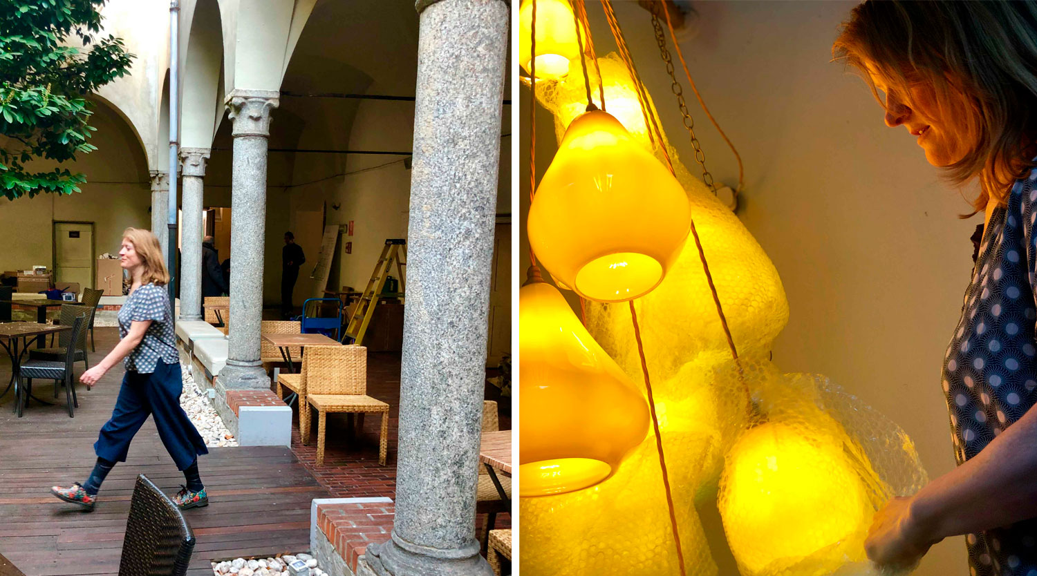
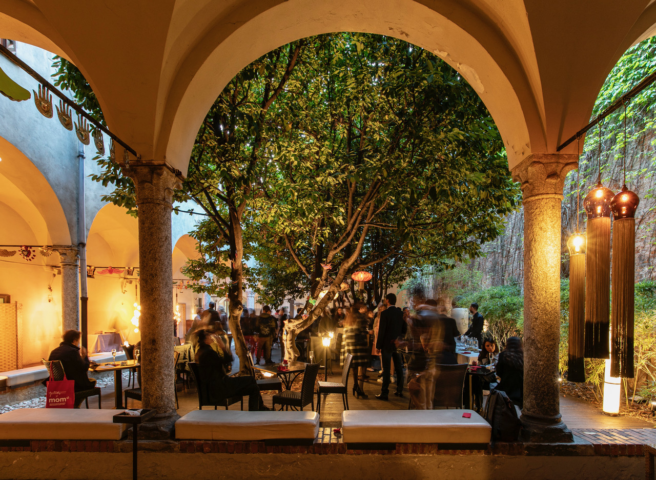
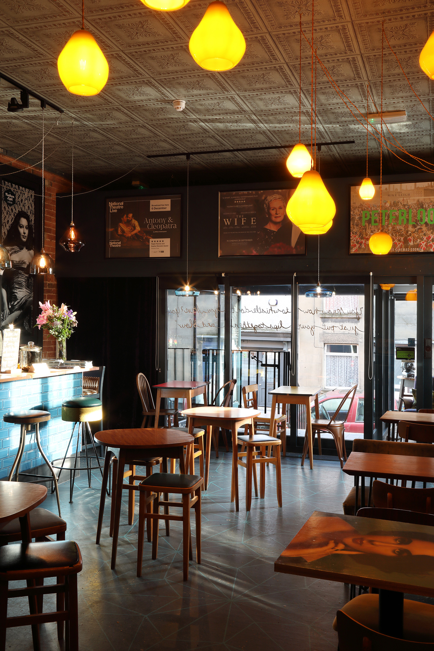
Innovative designers and artisans Blackpop, Curiousa & Curiousa and Royal Crown Derby not only share their Derbyshire base, but a passion for design, British manufacturing and the celebration of colour. The Derbyshire Collective Café will provide a sumptuous, eclectic and dramatic entrance to the Syon Park location.

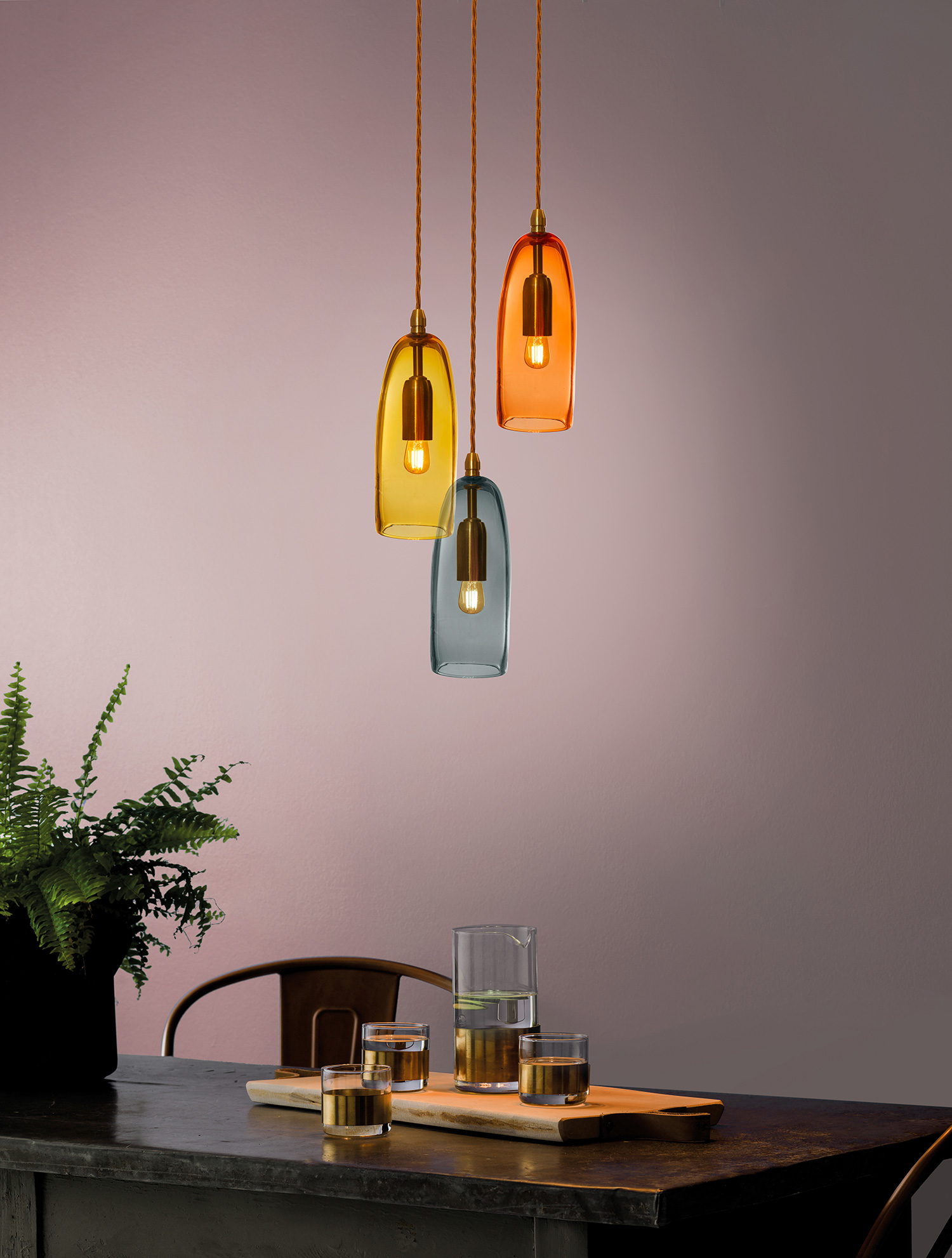
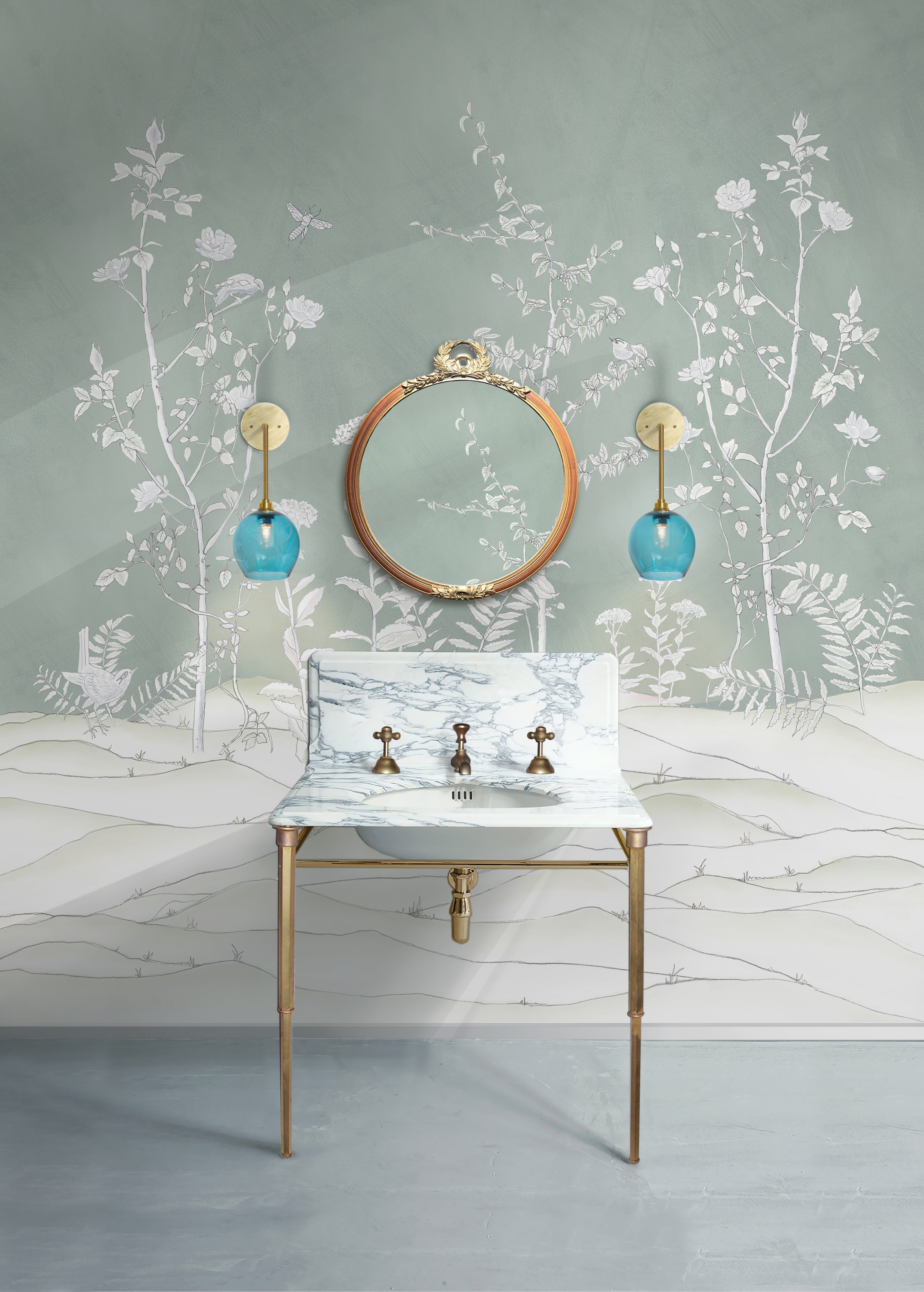
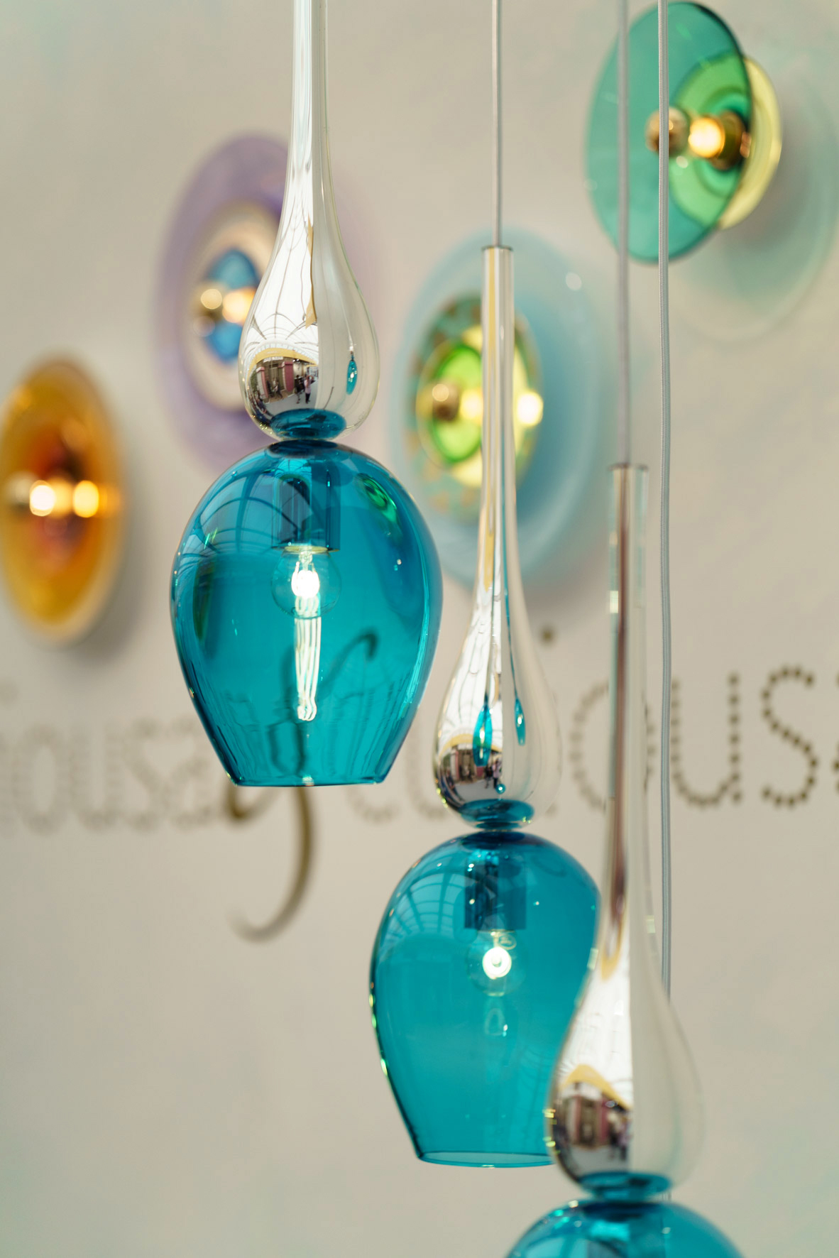
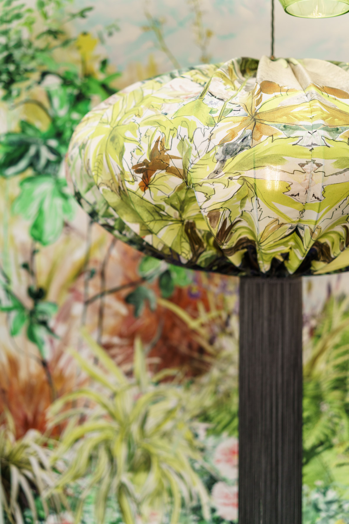
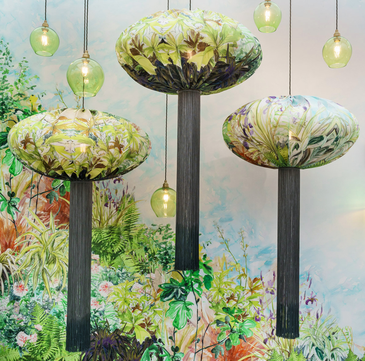
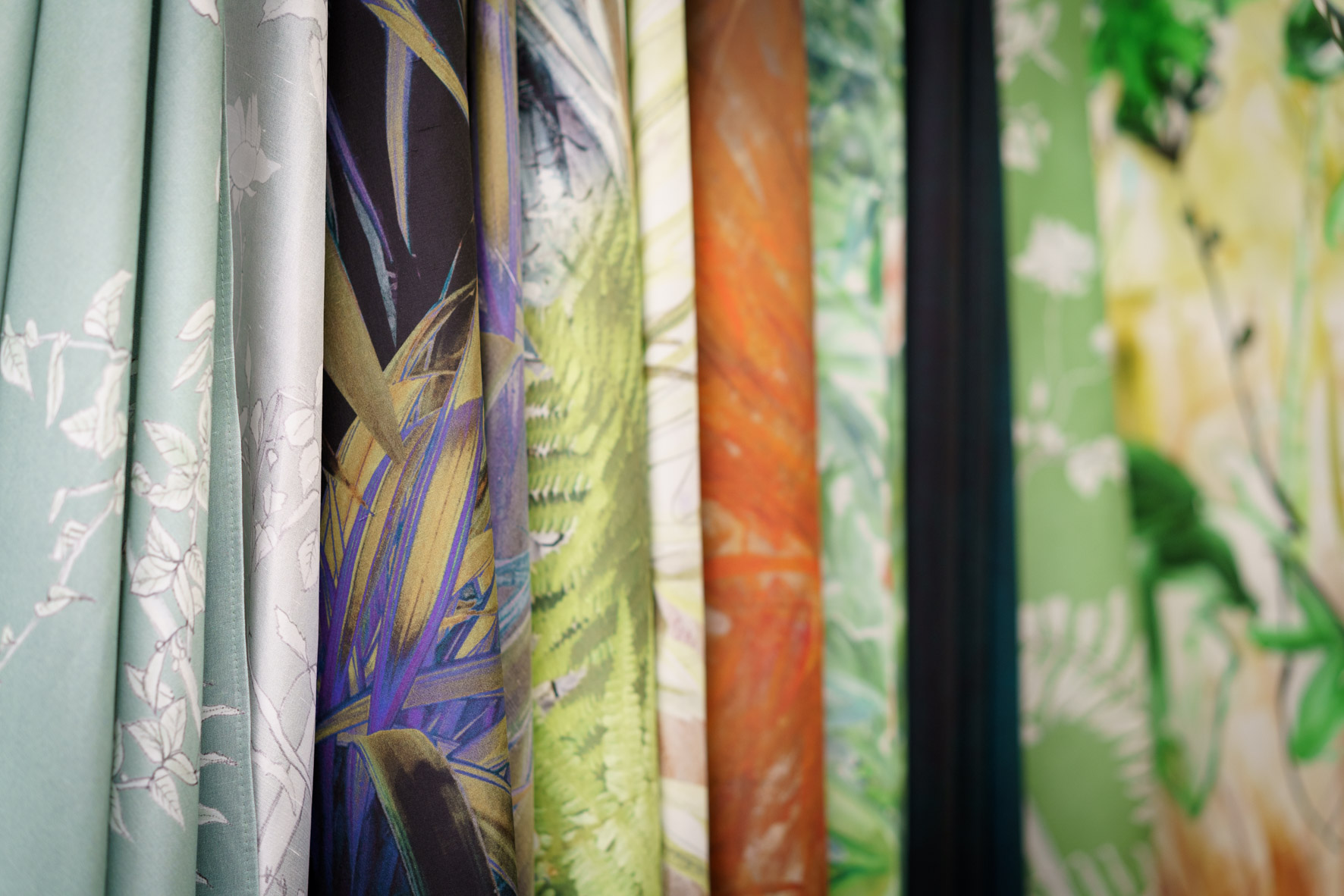
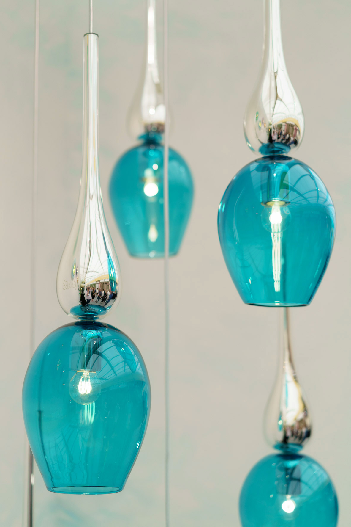
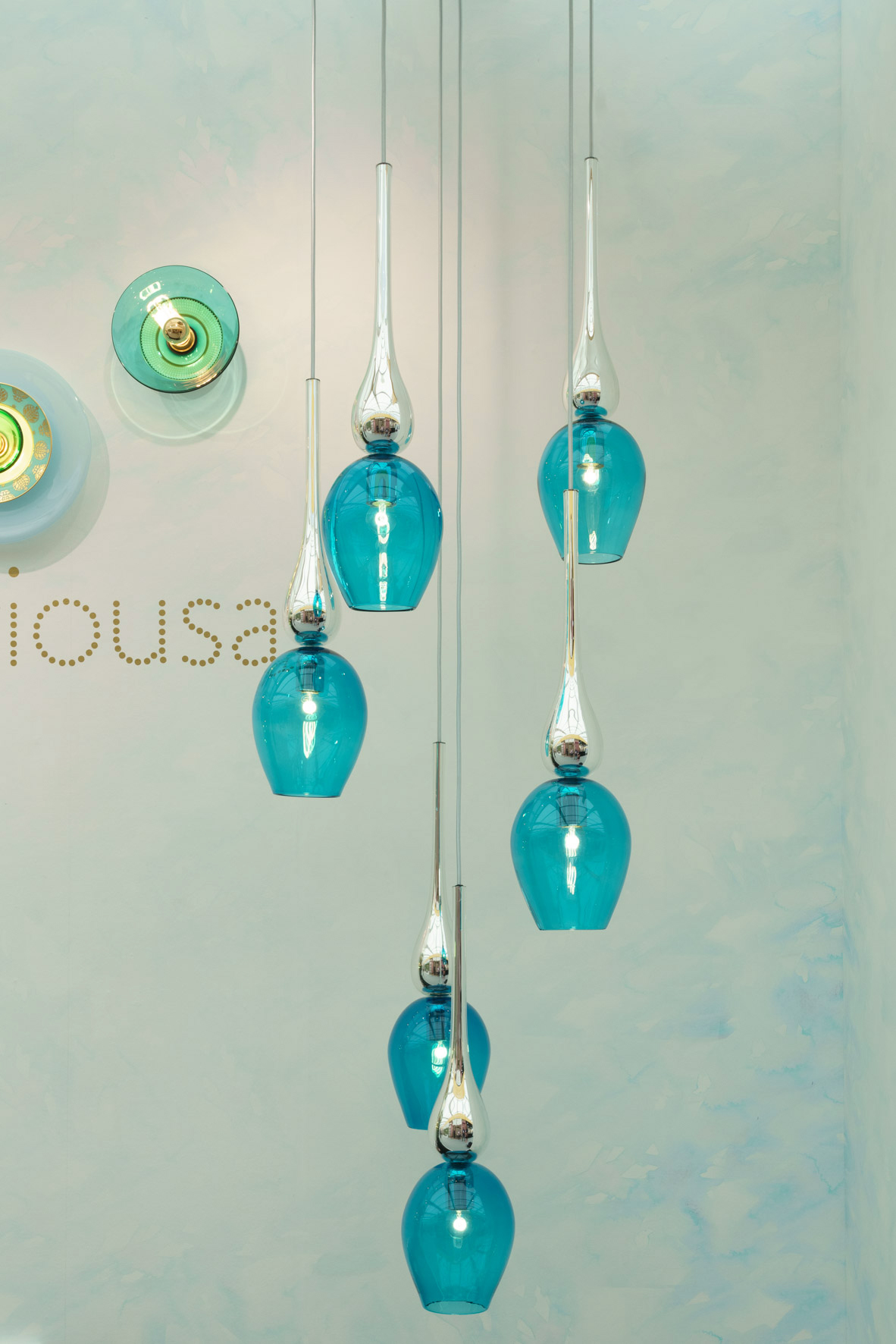
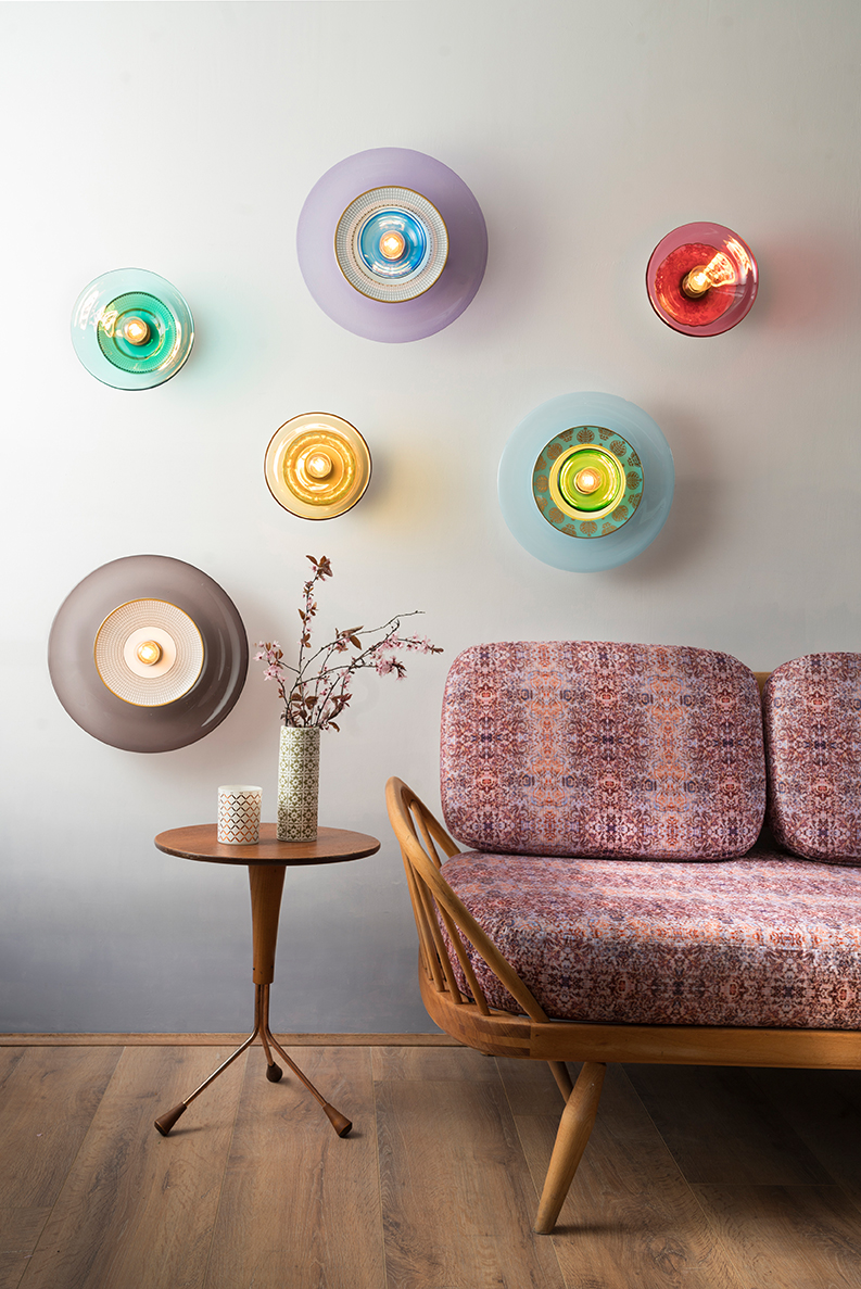
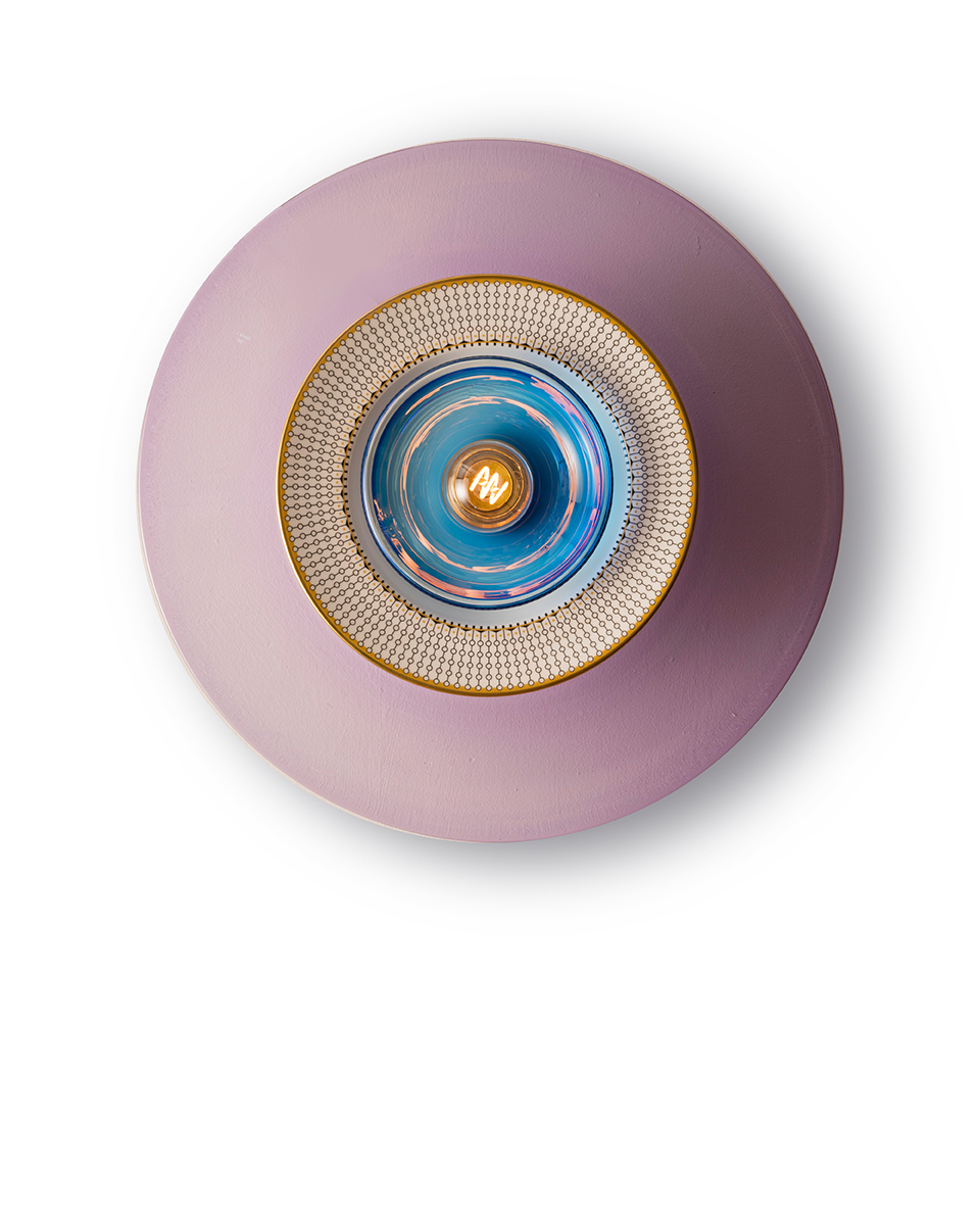
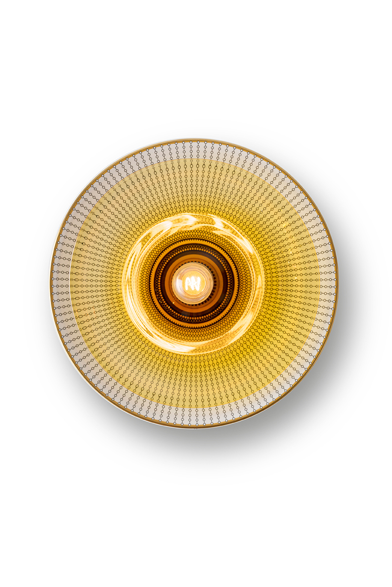
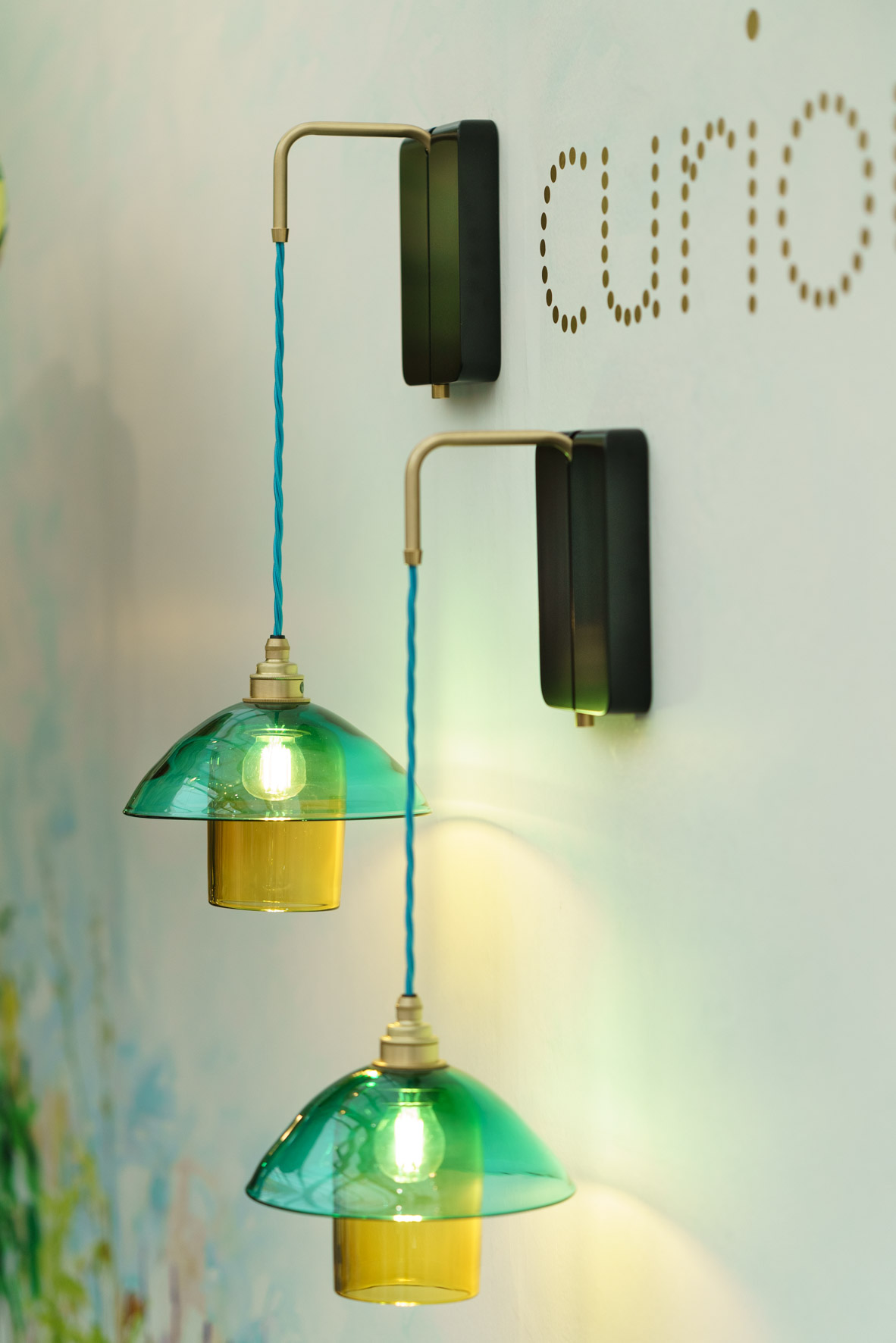
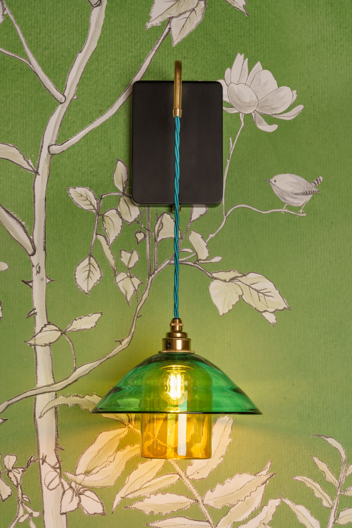
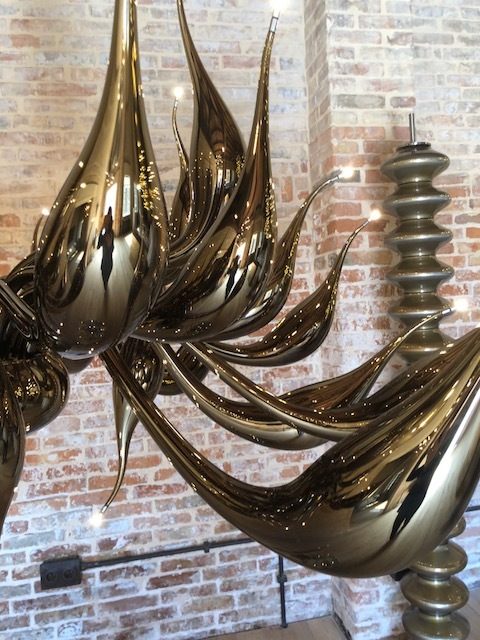
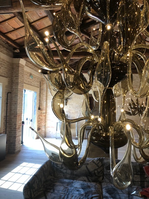
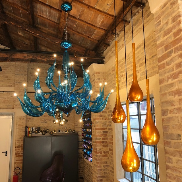
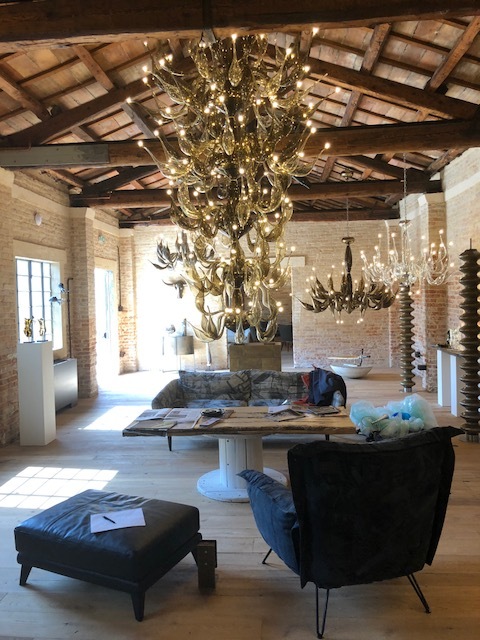
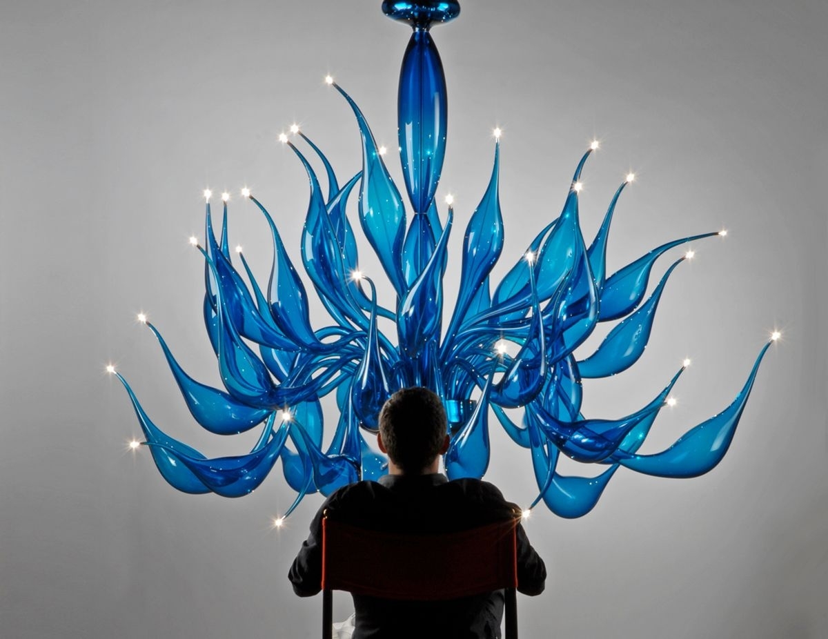
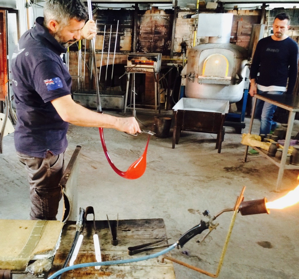
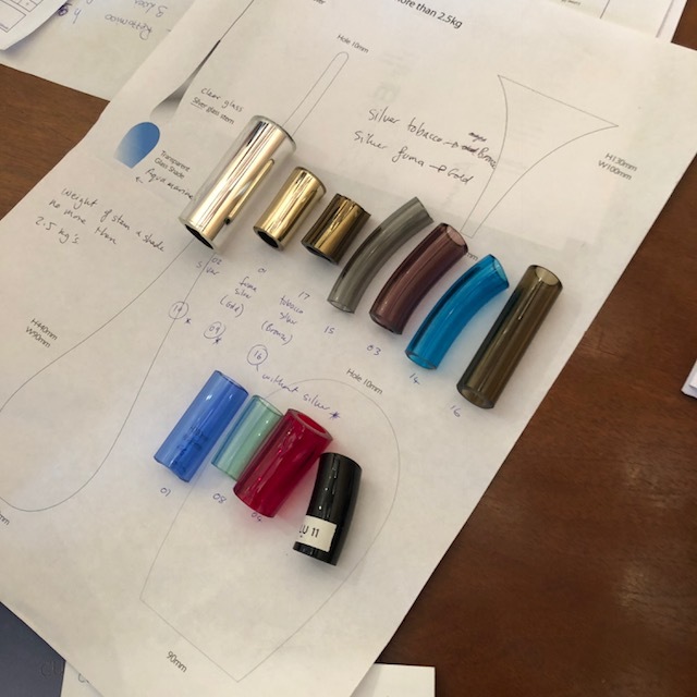
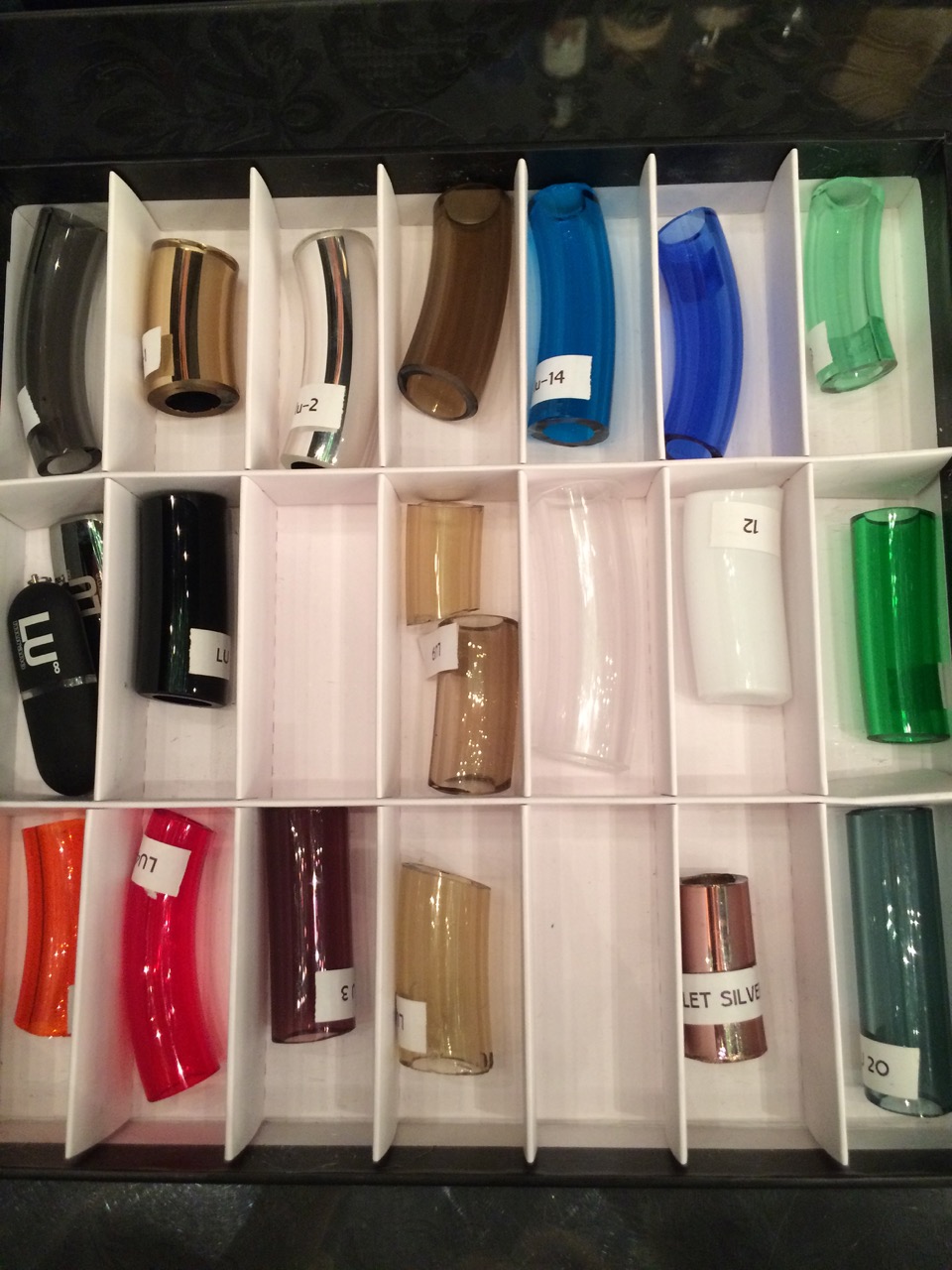
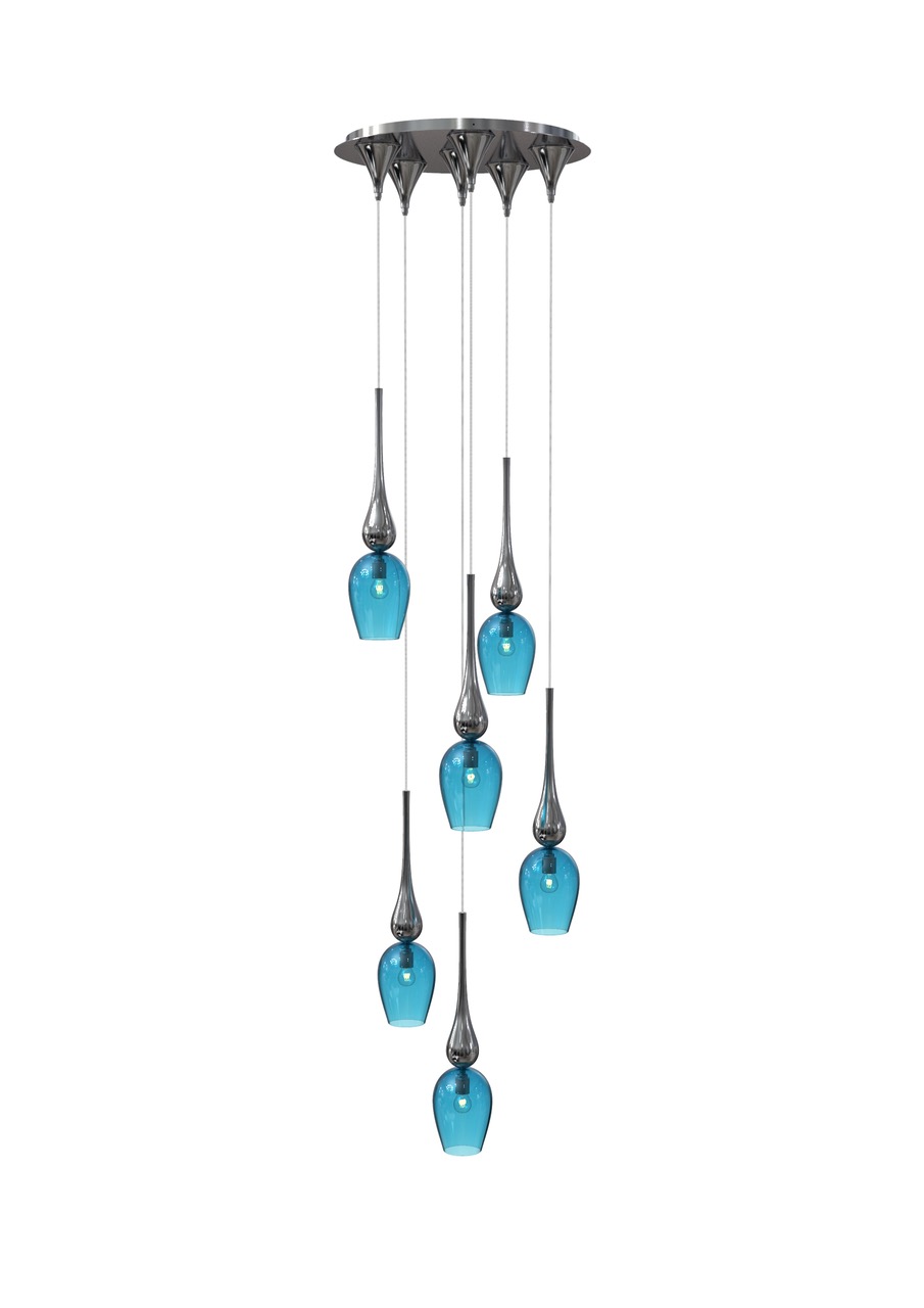
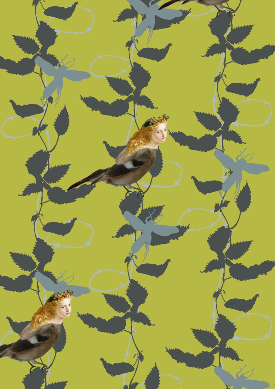
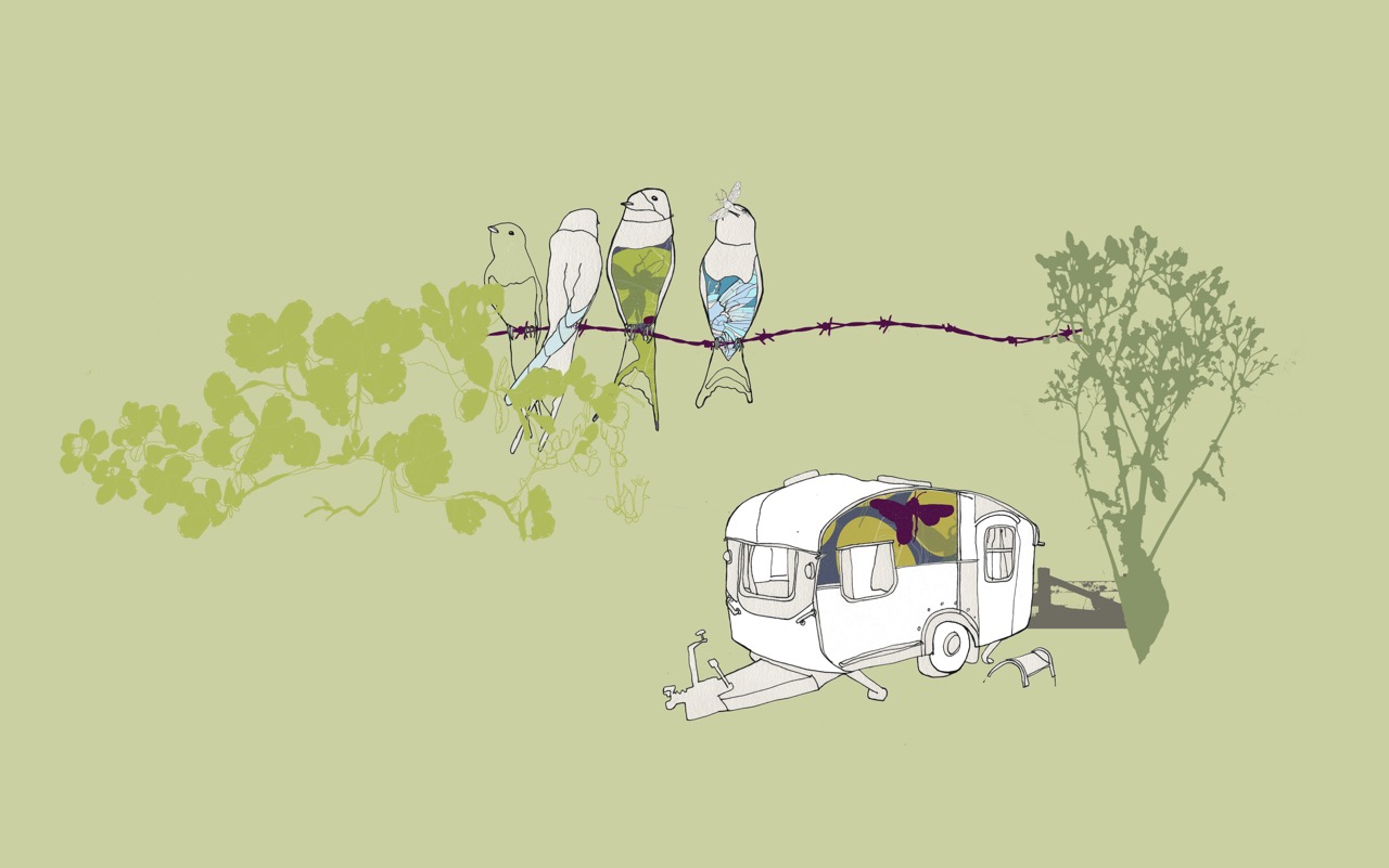
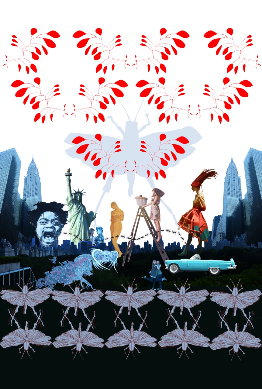
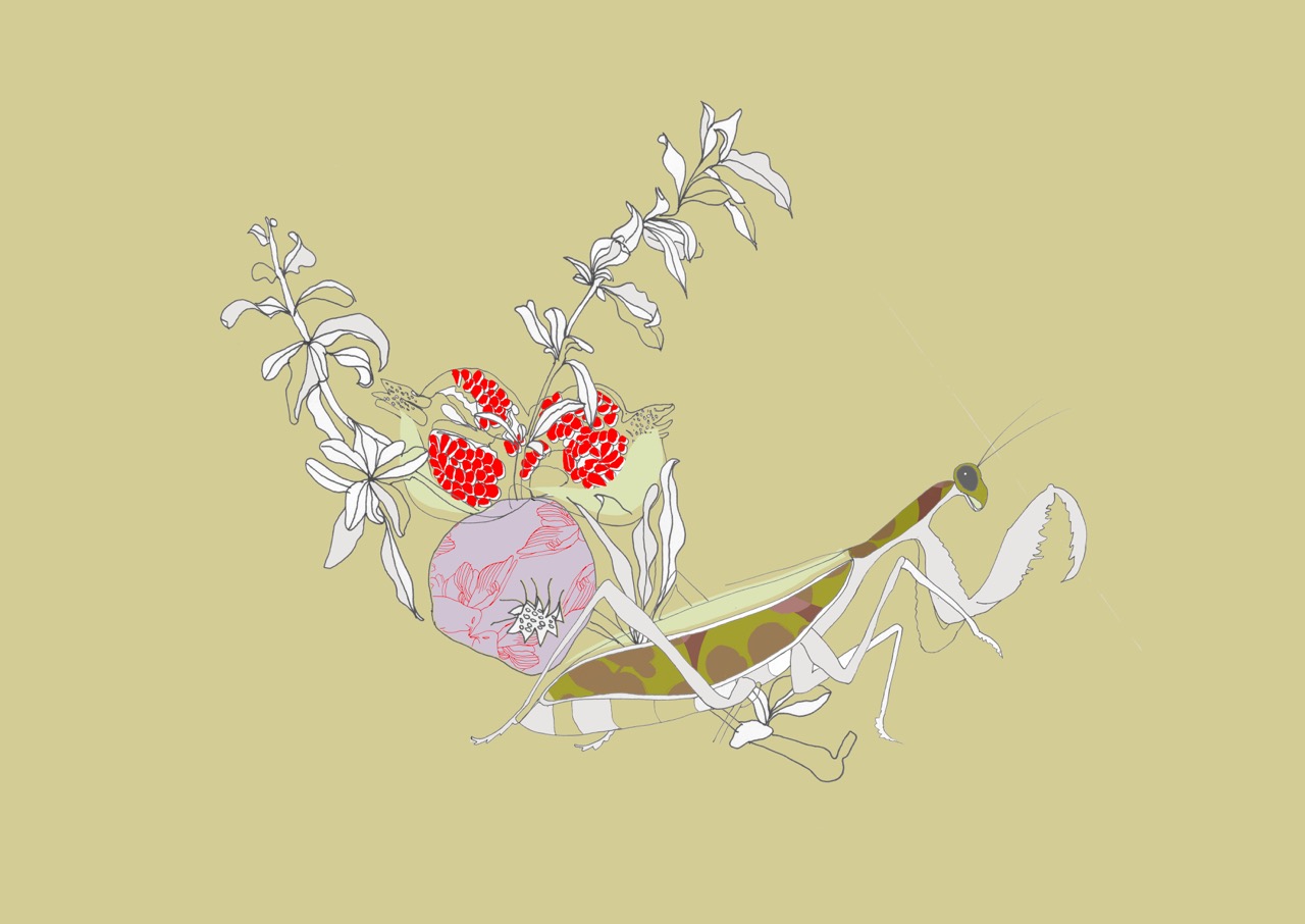
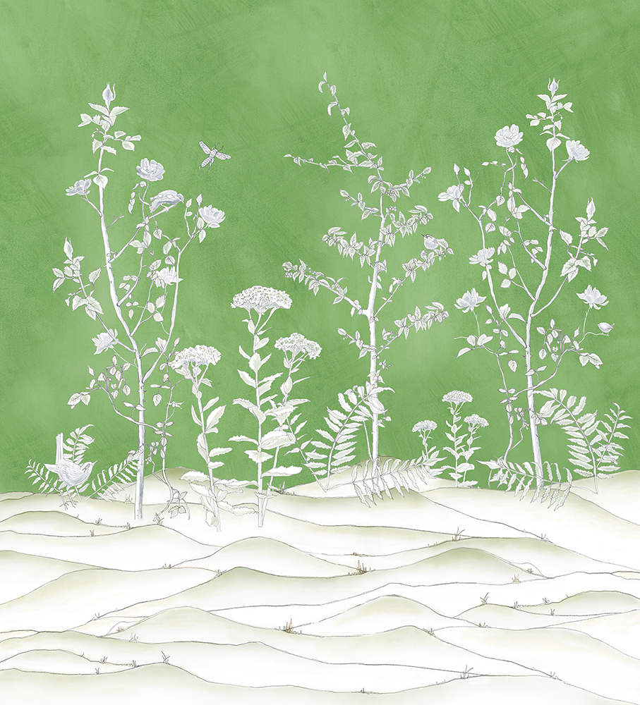
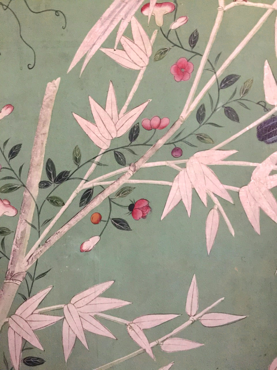
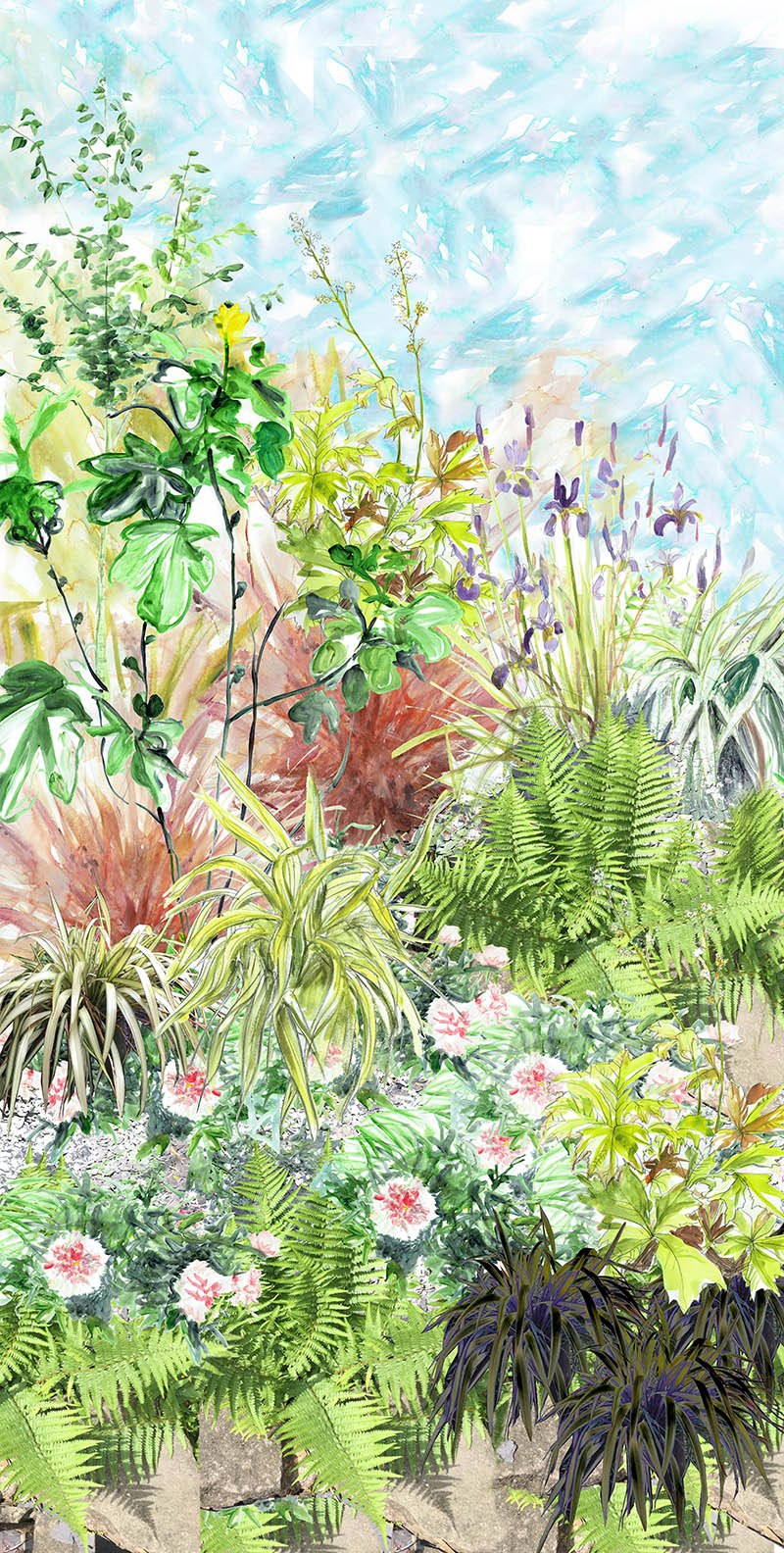
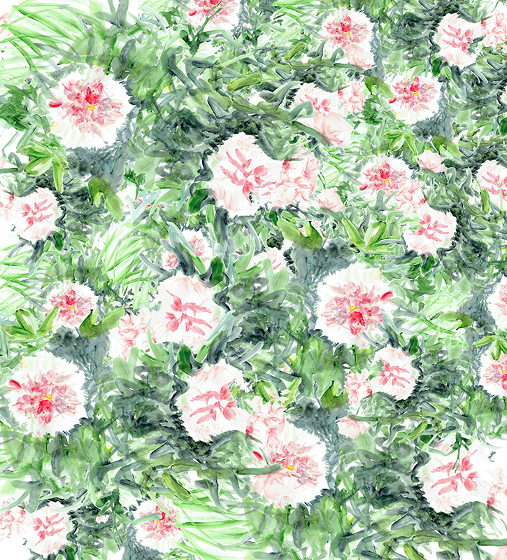
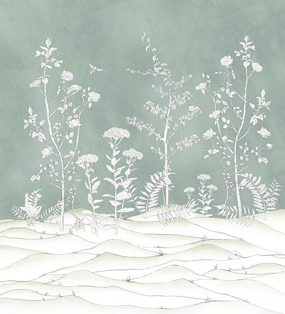
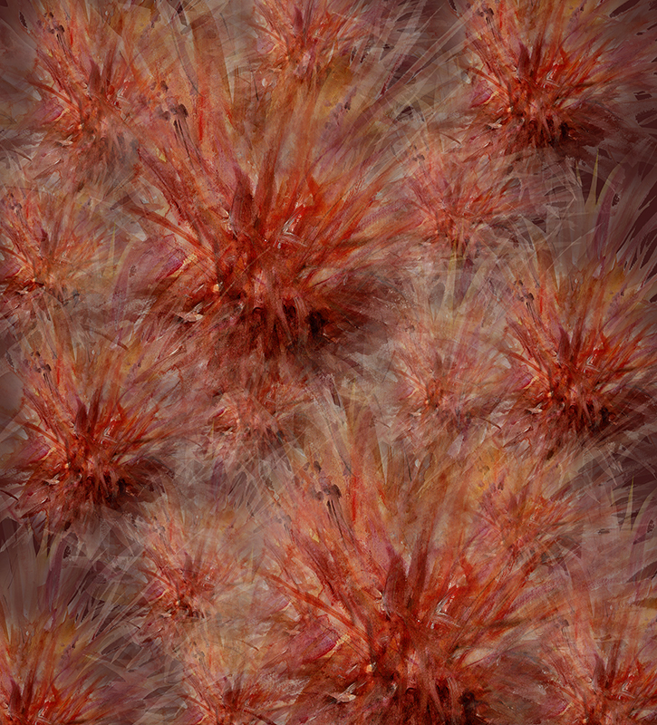
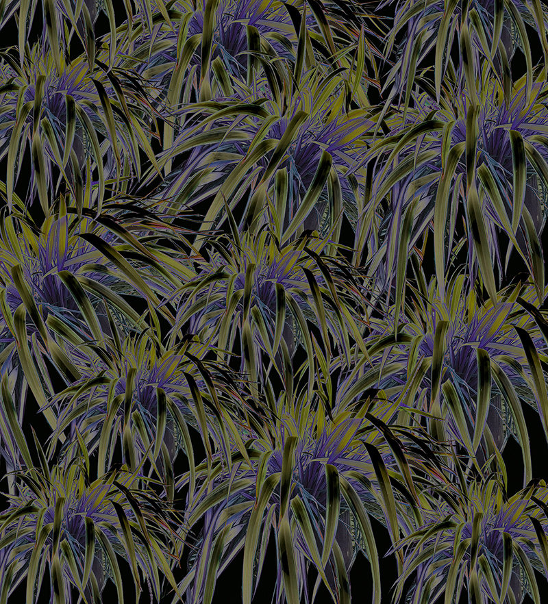
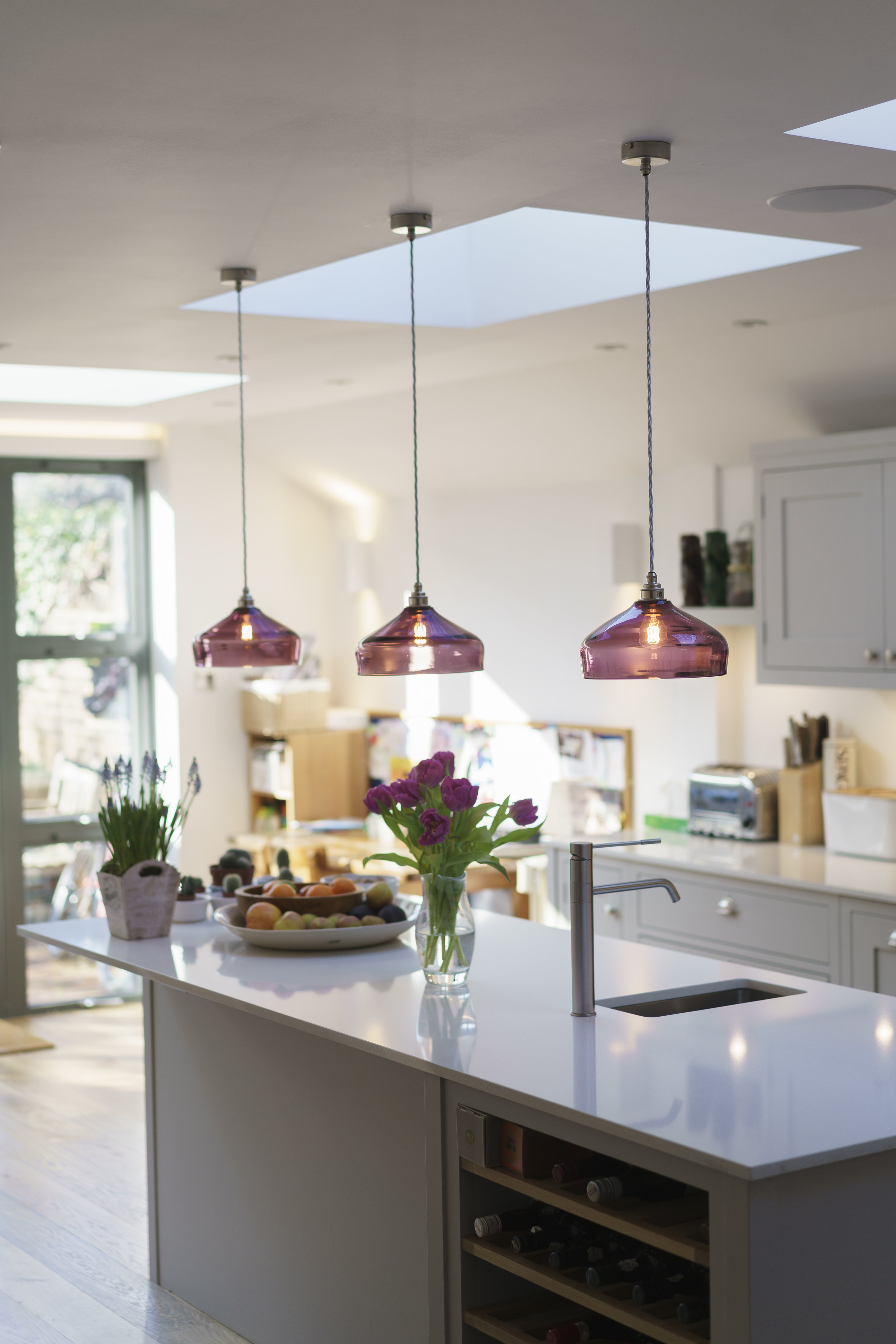
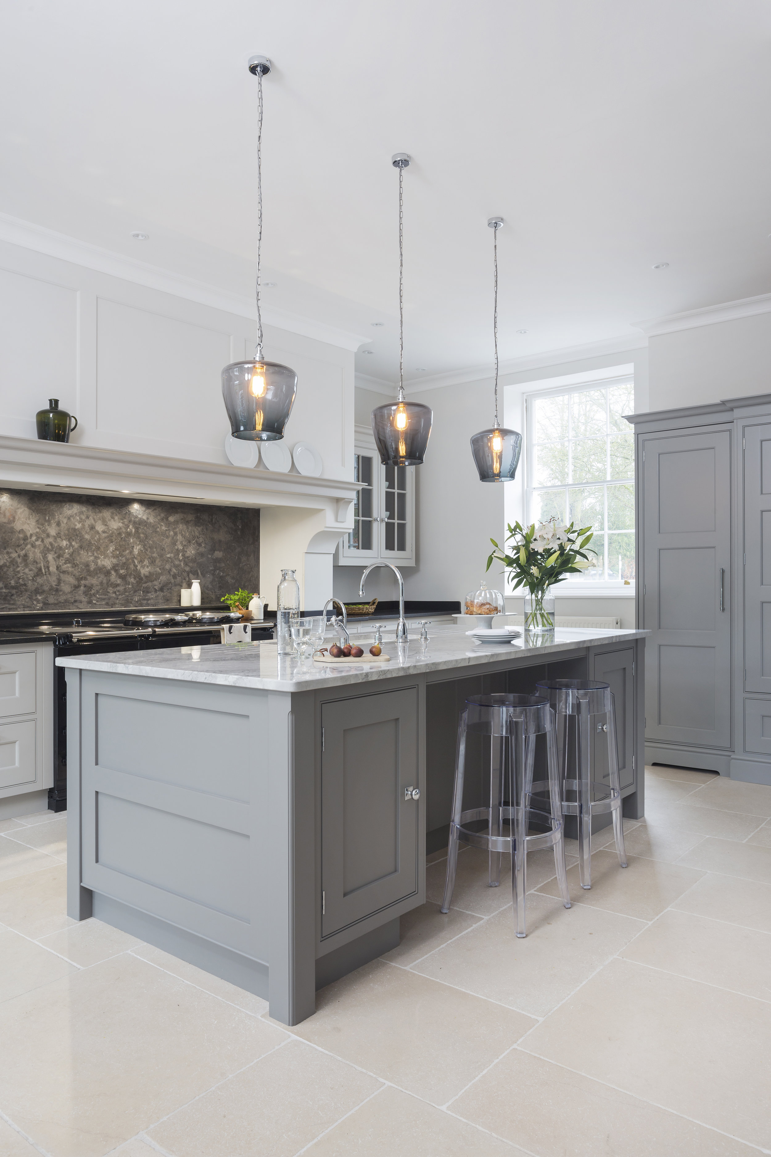
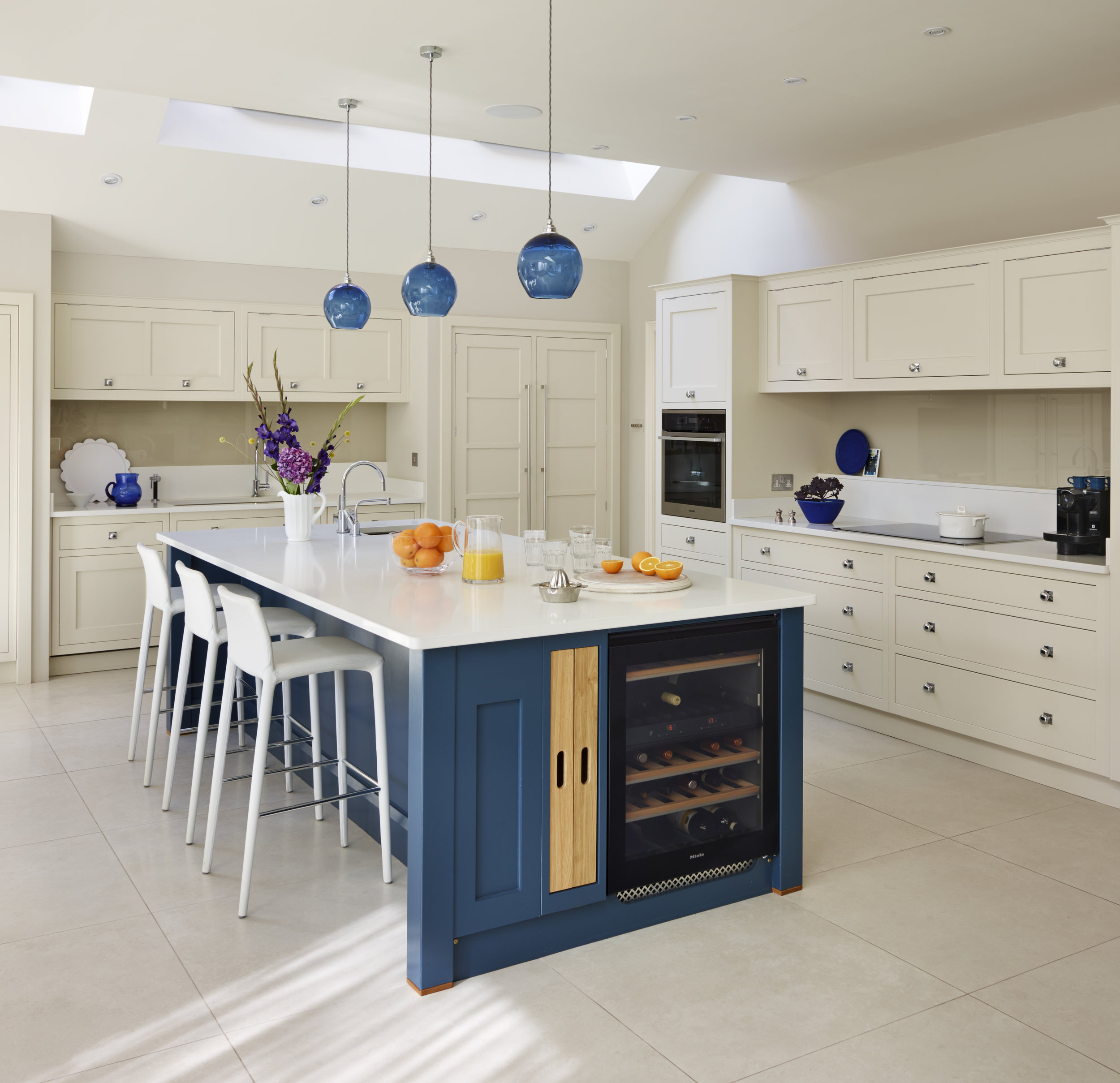
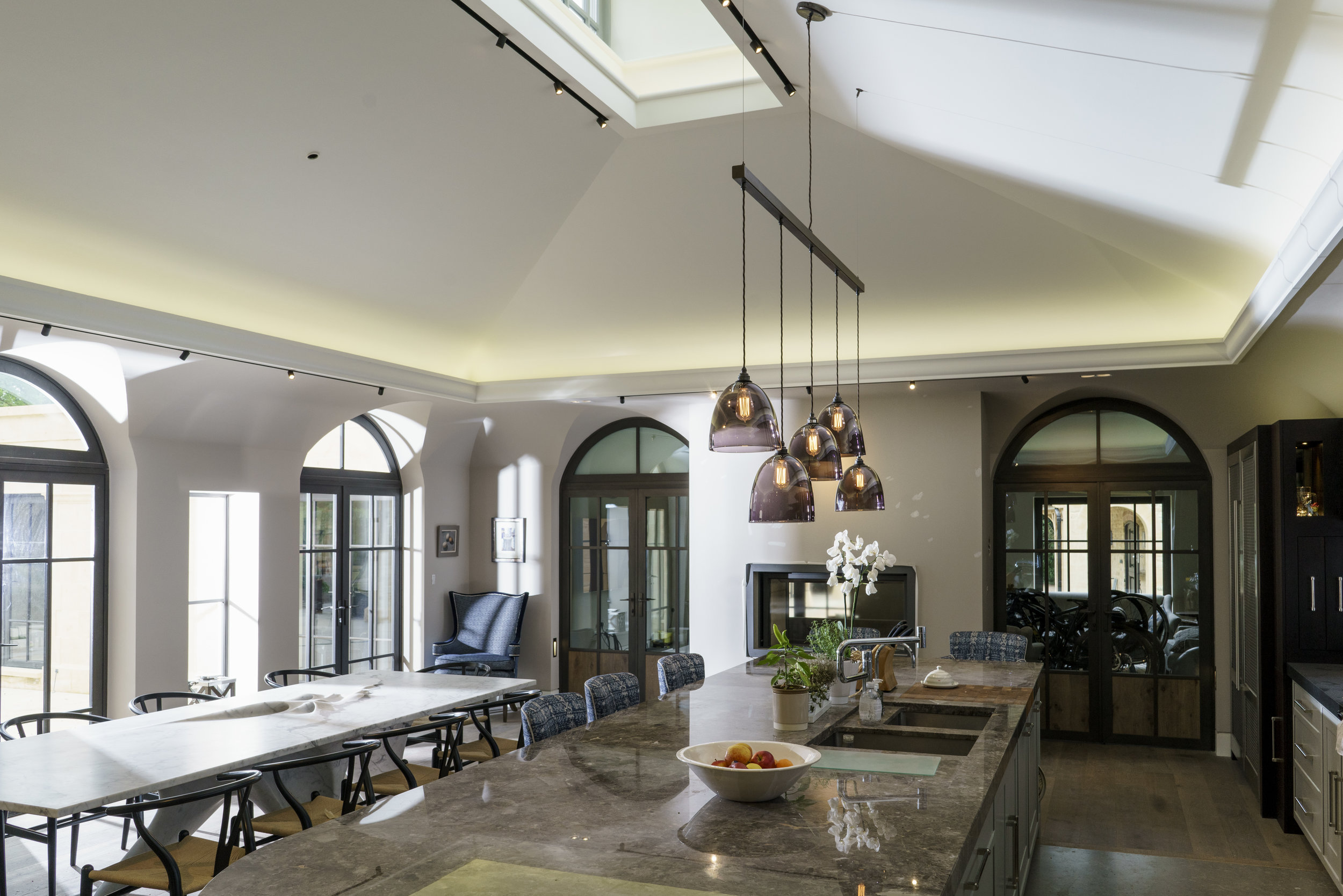
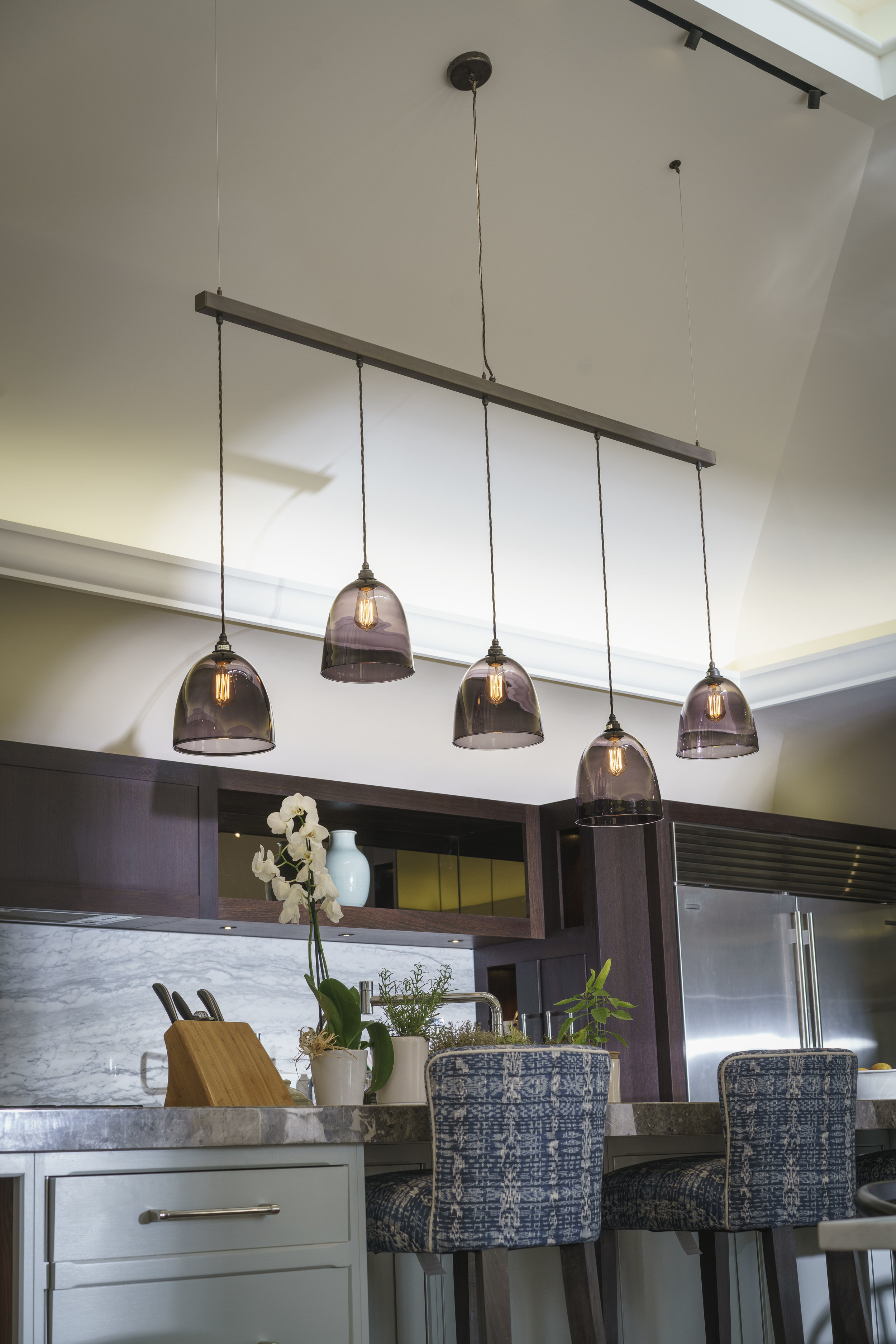
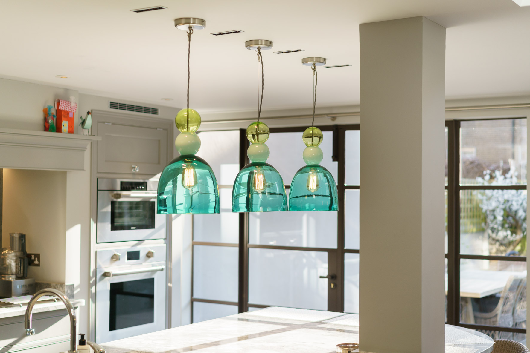
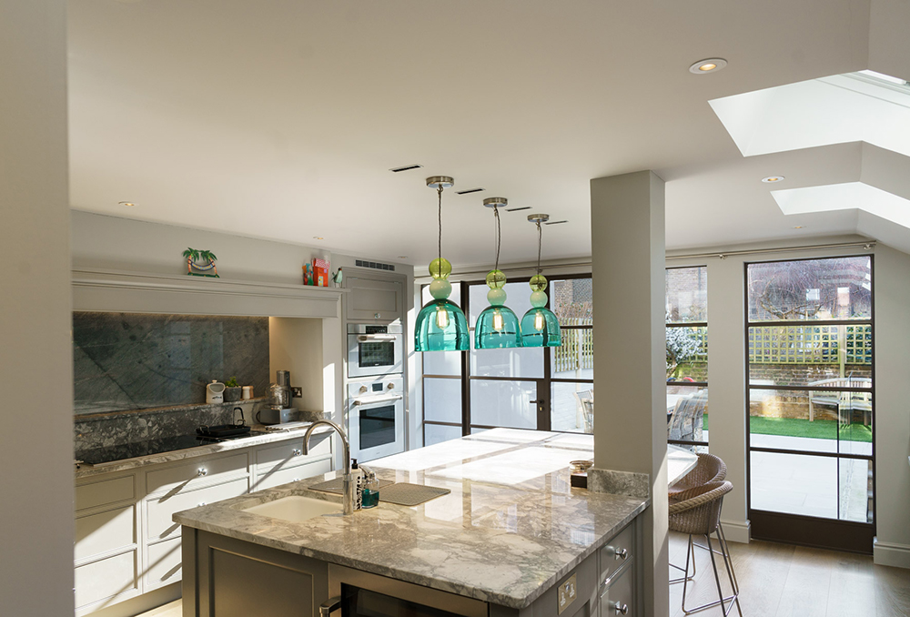
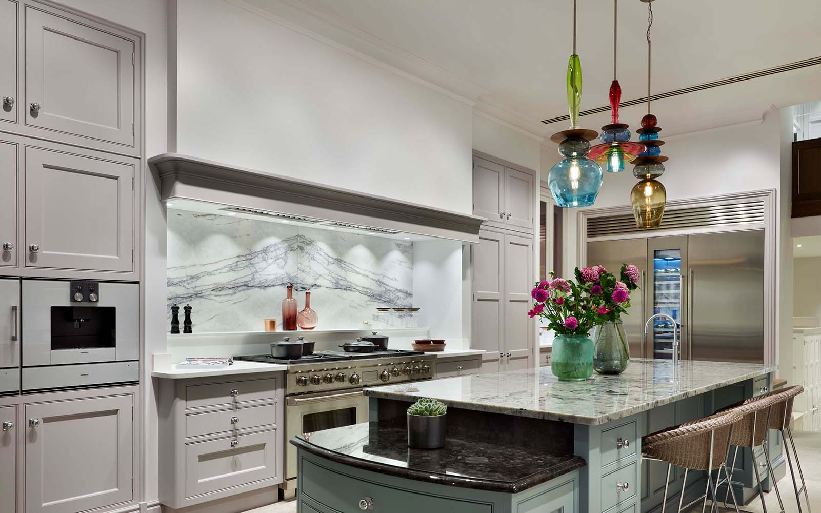
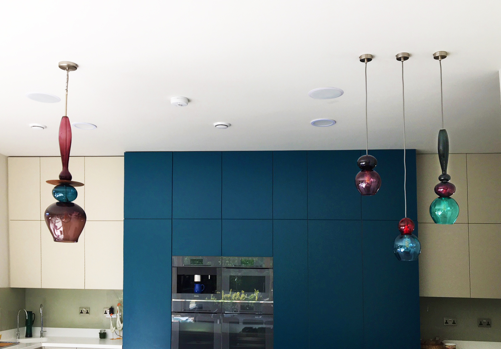
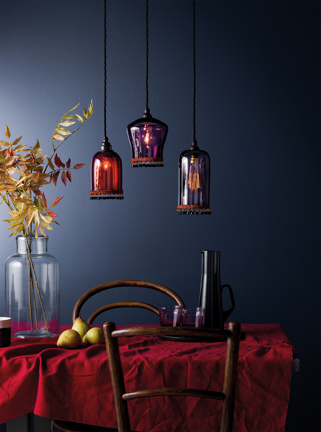
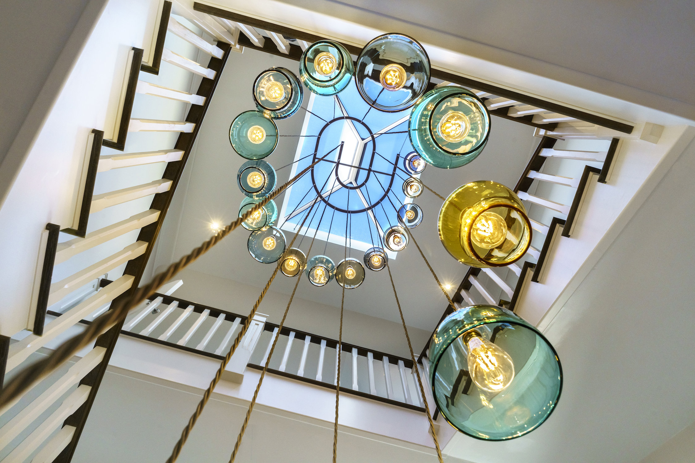
Blackpop, who produce wallpapers and fabrics that 'punk up the past’, are creating bespoke table dressings mixing their trademark anarchic wallpaper patterns with a mix of surface pattern designs in the form of plate shapes from fine bone china manufacturer, Royal Crown Derby. Curiousa & Curiousa, renowned for their hand-blown glass lighting with colour at the heart of their appeal, will produce a series of playful stacked light chandeliers fusing glass shades with Royal Crown Derby’s fine bone china tableware to give an artistic and modern twist.

Royal Crown Derby’s Sales and Marketing Director, Steve Rowley, said: “We’re honoured to have been asked by Decorex to take part in the 40 year celebrations and have the opportunity of styling alongside fellow local brands, Curiousa & Curiousa and Blackpop main entrance café to be known as The Derbyshire Collective. It clearly showcases the high quality craftsmanship originating from the Derbyshire region.

“As a brand, we thrive when working alongside inspirational and innovative design excellence. We feel that both Curiousa & Curiousa and Blackpop align with our company values for providing customers with the highest quality, bespoke products which are manufactured completely in the UK.”
Design Director, Esther Patterson of Curiousa & Curiousa commented, "Having worked for a few years alongside Royal Crown Derby and Blackpop, I’m really excited about our first design collaboration, bringing the 'Derbyshire Collective' to the Decorex audience. I’m passionately proud of my rural roots so it will be great to show the creative industries are thriving outside the city.”

Design Director, Maxine Hall of Blackpop said, “Blackpop are excited to be collaborating again with our Derbyshire neighbours Curiousa & Curiousa and Royal Crown Derby - what a creatives dream! Our sumptuous wallpaper and fabric designs will be in their element, entwined with hand decorated fine bone china and colourful hand blown glass pendants, celebrating in style Decorex's 40th anniversary”.
Together, this Derbyshire Collective aim to establish an opulent yet outré aesthetic, championing innovative Midlands design, in celebration of Decorex’s landmark year.


To receive your guest badge click here

Decorex International 2017 - Stand A35

Decorex_Blog.jpg

Launching exclusively at this years Decorex, Curiousa & Curiousa introduce their new chandelier
‘Tiger Lily’. This striking piece hints at our Colonial past with it’s art deco feel and far eastern
influences. Creating a striking yet elegant light that injects an intoxicating blend of luxury, colour and decadence.

Curiousa & Curiousa’s designer Esther Patterson commented ‘The tassel lights evoke a bygone age of opulence from the daring 1920’s and the influences at that time from the British travelers who brought back rich and luscious textiles and objects from the far reaches of our planet. As a nation we embraced these influences and a special style emerged from this. But to bring this piece up to to date we’ve mixed a contemporary Copper, rich Aubergine, Smoked Olive and Yellow Ochre.

Also launching at Decorex is the 'Lotus Dine’. Individually free-blown and hand-crafted to order, 'Lotus Dine' features three pieces of hand-blown glass, suspended beneath a bespoke, half metre disk of walnut wood, and their new table lamp; ‘ The Tulip’. This elegant stemmed light was inspired by both masculine and feminine design influences, fusing solid lines with a softer silhouette to create a striking lamp that gives a nod to mid Century modern design.

Stand A35, Syon Park, London, Sept 17-20


The Brains Behind Curiousa

Absolutley London

Absolutley London

Sometimes you need somone else to write your story to realise just how amazing it's been. Pendle Harte spent an afternoon with Esther in our Islington showroom and wrote a wonderful piece for Absolutley London.

Read her article here.

Photograph by Jack Bridgland for Berkeley Magazine

Wirksworth Festival Sale

WIRKSWORTH FESTIVAL 9-10 SEP, 2017

WIRKSWORTH FESTIVAL 9-10 SEP, 2017

We're opening our doors once more at this year's Wirksworth Festival. Not only can you see all our latest designs, but we will also have or once-a-year only offer of up to 50% discount on all our seconds in stock!

Now entering our second year here at Haarlem Mill, this is a great chance to explore this historic building as well as browsing our shelves to see how we can help light up your home.

We're open Saturday 9th September, 10am-5pm and Sunday 10th September, 11am-4pm

Bedtime Stories

How to create a stylish bedroom with colour

By Rachel Ogden for Button & Sprung

Colour can boost our mood, brighten up grey days and is one of the easiest ways to change the look of our homes – so why are we so reluctant to use it in the bedroom? Neutral schemes still reign supreme but the good news is that you don’t have to step out of your comfort zone to refresh your space with colour. Try these ideas to brighten your bedroom in an instant…

Primrose King Size Bed Frame in Fuchsia fabric, from £645

Add personality with paint

The bedroom is the perfect place to change how you think about paint. Rather than selecting one pale wall shade as a backdrop and planning a scheme from there, try to choose your paint colours as part of the whole palette. For example, you could take your colour cue from your linen, bed frame or a statement chair, then choose complementary or contrasting shades for your walls. Paint isn’t limited to walls either, so think about continuing colours onto furniture or painting your floorboards.

Annie Sloan, paint expert and founder of Annie Sloan Interiors

‘As the bedroom is a room that’s not often on show, you can choose colours that are personal. People may be surprised to hear that my bedroom is painted in a deep blue called Aubusson. It always looks welcoming at night when I put the bedside lights on. I’ve combined it with white linens and soft colours elsewhere in the room. Duck Egg Blue would be a perfect choice for someone less daring. I think of it as a neutral, which means you can combine it with others and they won’t fight against one another.’

Be a shade braver

While the primary function of lighting is to illuminate, it can be more than that, adding a layer of colour to any space. Once you’ve worked out where you need lighting and what type (try to include a mix of table lamps, wall lights and pendants), you can start to experiment with different designs. Coloured glass shades are a big trend, especially when combined with visible filament bulbs, while lamp bases in rich jewel tones look effortlessly elegant.

Esther Patterson, designer and director at Curiousa & Curiousa

‘In a bedroom, I love the opportunity to hang wall or pendant lights at either side of the bed as it’s a great way to punctuate the room with colour. Soft, restful shades work well, such as aubergines, greys or purples. Alternatively, if you want more of an airy summery feel, add some vibrant colours into the mix. Canary yellow with white linen can look stunning.’

Take inspiration from art

If you’ve fallen in love with a piece of art that’s destined for your bedroom, it can work well as a starting point for a colour scheme. However, when an artwork’s primary function is introducing colour, choose it after most of the major elements to ensure it doesn’t dominate the room. By doing it this way, you can layer colours, or use it to balance bold shades by providing a moment of calm. Be sure to pick a theme that won’t clash – for example, a coastal picture may look out of place in a bedroom filled with exotic décor even if the colours are complementary.

Finish with flowers

Small decorative touches can have a big impact and none more so than flowers. A fresh floral arrangement is a real treat, so display them in a vessel that reflects the style and colour of your scheme. Placed prominently on a bedside table or windowsill, flowers are an easy way to add changing colour with the seasons or enhance the feel of your bedroom, whether that’s a vibrant space or a relaxing sanctuary.

Sara Gordon, brand and creative director at flower delivery service Bloom & Wild

‘Bright flowers bring energy into the room, while softer colours bring a sense of calmness. I love to mirror the existing colours of bedding and décor with blooms, whether it’s bold brights, such as matching a pink rose with a pink cushion, or a more muted bouquet next to delicate bedding or wallpaper.’